Introduction
Soft pastel artists know that paper is just as important as the pastel itself. The right surface can elevate a piece by allowing your unique style and technique to shine through. With the incredible variety of pastel papers available—featuring different textures, colors, and weights—it’s easy to become overwhelmed. That’s why I ordered the Sample Pack from Dakota Pastels: to explore new options and see how each paper worked with my mark-making style and painting approach.
What I’m Looking For
This review is entirely based on my personal preferences and how well each paper supports my artistic process. Here’s what I focused on:
- My mark-making style (how I apply pastel).
- The ability to layer pastels and retain vibrant color.
- Paper that handles wet media for underpainting (acrylic or watercolor).
- The texture and visual finish that the paper provides.
This isn’t a judgment on the overall quality of each paper—some may work beautifully for other artists.
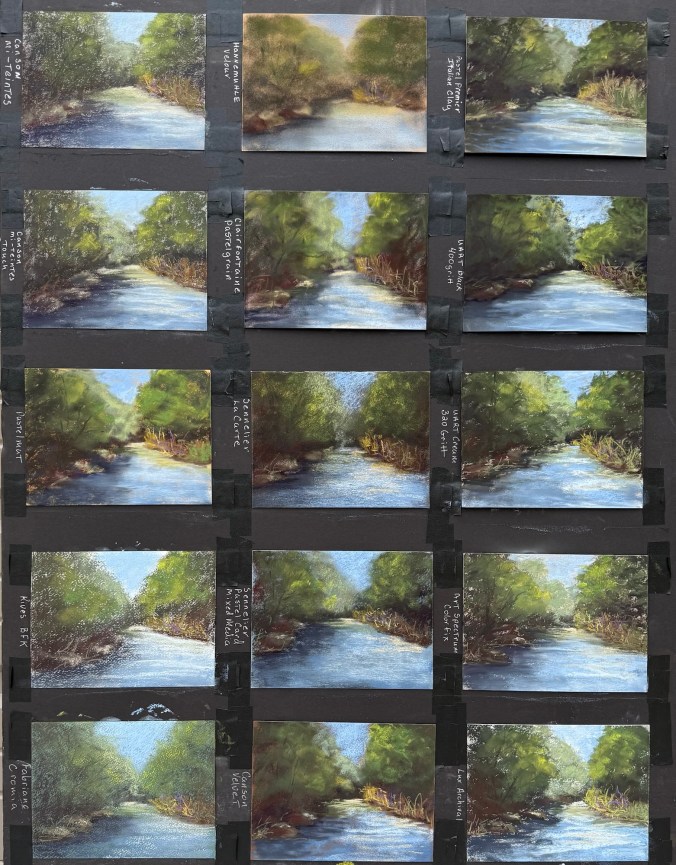
My Testing Approach
To ensure consistency in this experiment, I kept several variables the same:
- Painted the same scene for each test.
- No underpainting: direct painting with minimal blending (which aligns with my typical technique).
- Used the same pastel brands: Terry Ludwig, Sennelier, Richeson Handrolled, NuPastel (hard pastel), and a new-to-me soft pastel, J.Luda.
- Each test painting was done in 15–20 minutes.
I began with papers I’ve used in the past to “warm up,” then moved on to unfamiliar surfaces.
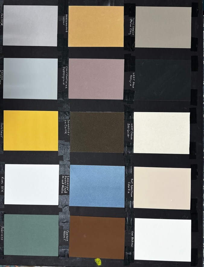
My Results (Starting from Top Right of the Sample Pack, Moving Down)
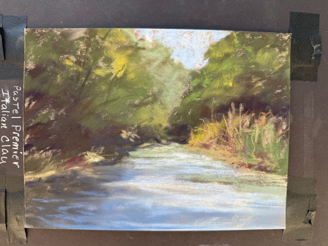
1. Pastel Premier – Italian Clay
USA | 100% cotton | Medium tooth aluminum oxide grit | 310gsm | Wet media friendly
A reliable favorite. Durable with a great tooth for layering, it handles strong mark-making and almost behaves like a sanded surface. I enjoy this paper for its durability and consistency. Be mindful: the paper color impacts the overall tone. Great for landscapes and rusty vehicles.
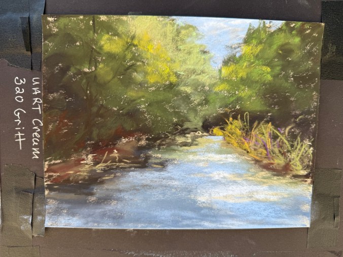
2. UArt – Cream, 320 Grit (Coarse)
Germany | Sanded surface | 200 grit course to 800 grit fine | Wet media friendly
My go-to paper for years. The coarse grit grabs pigment incredibly well, allowing deep layering and vibrant texture. It is best to use hard pastels like Rembrandt or NuPastel for your base layers, as soft pastels will be used up quickly. The paper can curl, but flattens easily. I’ve used this paper for landscapes and rusty vehicles.
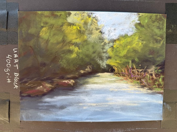
3. UArt – Black, 400 Grit (Medium)
Same durable performance as Paper #2 but in black and slightly finer grit. The black surface intensifies color vibrancy and subtly blends tones. A noticeable shift in mood and contrast between this and the cream version. I’ve used this paper for rusty vehicles, and I can see using it for future landscapes.
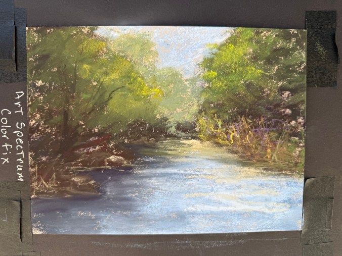
4. Art Spectrum Colourfix – Cream
Australia | Acrylic-primer on watercolor paper | Medium tooth | 300gsm | Wet media friendly
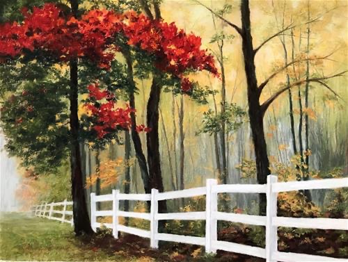
It’s been years since I used this paper, and it pleasantly surprised me. Good texture, not too hard on pastels, and lots of layering potential. Available in many colors—great for creative paper integration in your design. Some of my favorite landscapes were created on this paper like Komorebi (see painting with red leafed trees below), allowing the yellow paper to show through. I have not used this paper on rusty vehicles as I don’t believe it is gritty enough.
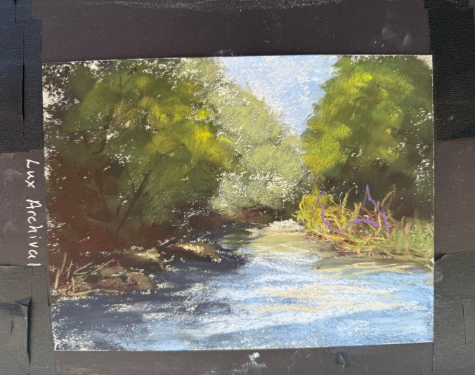
5. LuxArchival
France | 100% cotton | Medium/coarse tooth | 300gsm | Wet media friendly
Gritty to the touch but goes on smoother than expected. This is a strong contender for future landscape and rusty vehicle work. It held pastel well and delivered clean layering. I actually have larger sheets of this paper, just haven’t gotten around to using it.
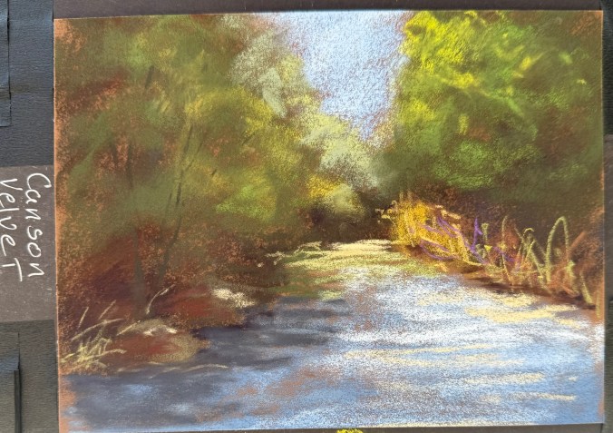
6. Canson Velvet
France | toned paper with a velvety finish | 430gsm | Wet media friendly
Though it doesn’t feel “velvety” to the touch, pastels glide smoothly over it. Rich color retention, softer final look. The pastel fills the tooth consistently, and it covers the paper well. NuPastels glide over the paper, so I needed to adjust my pressure to make the marks. Blending required a bit more pressure. The velvet left more texture than I expected. Possibly a great choice for animal portraits.
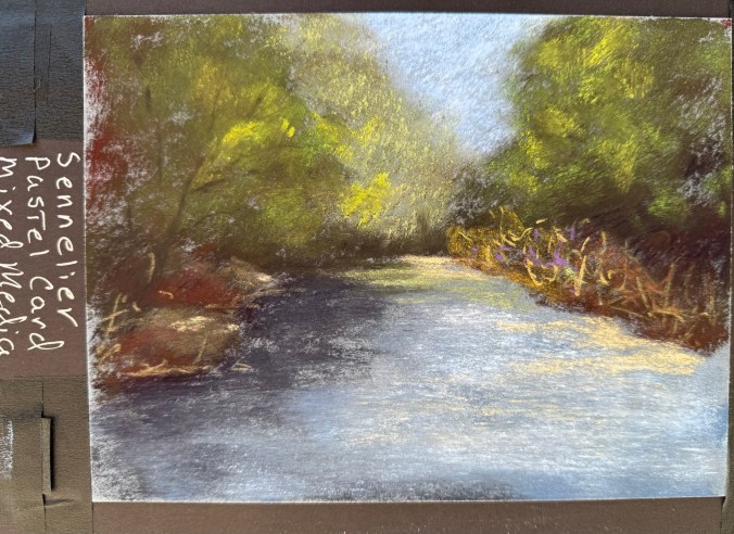
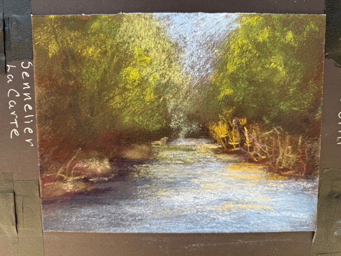
7. Sennelier La Carte Pastel Card – Mixed Media
France | coated in a fine layer of cork powder for a light grain | 410gsm | Water and solvent resistant
Rough surface with unique texture—not like sanded paper. The paper didn’t chew through the pastels, but I didn’t fill the tooth (on purpose for consistency). I may wash the paper and try mixed media.
8. Sennelier La Carte Pastel Card
France | coated in a fine layer of cork powder and vegetable flakes |medium surface | 360gsm | For dry media only
This didn’t work well for my style for landscapes—left a grainy look due to how I apply pastel. It might work for rusty vehicles.
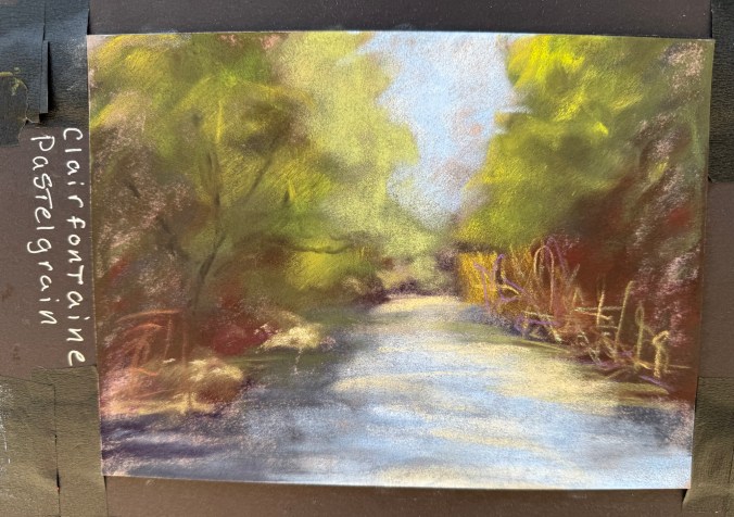
9. Clairefontaine – Pastel Grain
France | 360gsm | Wet media friendly
Lightly textured and soft-looking, especially when blended. Nice velvety finish when blended. It may be great for delicate subjects like pet portraits.
10. Hahnemühle Velour
Germany | Synthetic fibers | 260gsm
Truly feels like velveteen rabbit fur! Very soft surface that holds lots of pastel. Produces a romantic, dreamy look—ideal for soft subjects like animal portraits.
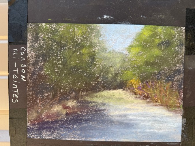
11. Canson Mi-Teintes
France | 160gsm | Honeycomb texture one side, fine grain other | I don’t believe this paper can get wet
Not ideal for layering—pastels get muddy fast. Needed to blend more than I usually do as the pastel didn’t cover well. This paper didn’t suit my technique well.
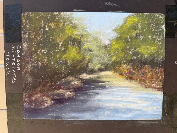
12. Canson Mi-Teintes Touch
France | Micro-abrasive coating | Wet media friendly
Very different from the original Mi-Teintes. I found layering difficult—colors muddied instead of building cleanly. This paper didn’t suit my technique well.
13. Pastelmat
France | Unique synthetic surface | 360gsm | Wet media friendly
Varied response depending on pastel brand—some went on velvety, others gritty. Required quite a bit of blending. It holds the pastel well, but may need some technique adjustments.
14. Rives BFK
France | 100% cotton | Printmaking paper
While absorbent and soft, it didn’t support my pastel technique well. Even Terry Ludwig’s darkest shades looked faint. When I did some research, this is a printmaking paper, and it doesn’t work well with my style. Maybe a blended underpainting would solve the issue of the texture showing through.
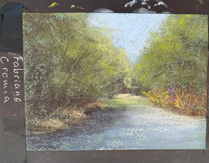
15. Fabriano Cromia
Italy | 50% cotton and 50% alpha-cellulose | 220gsm | Light wet media
Very similar to Rives in feel and performance. It would likely benefit from underpainting to combat paper texture showing through.
Final Thoughts
Exploring this wide range of pastel papers was enlightening. Some surfaces reaffirmed my continued use of Pastel Premier, UArt, and Art Spectrum; others surprised me, and a few didn’t suit my process, but may work well for artists with different styles or subject matter. I’m excited to revisit a few LuxArchival, Sennelier LaCarte Pastel Card Mixed Media, and Sennelier LaCarte Pastel Card with a more tailored approach and see what evolves.
If you’re thinking of trying a new paper, I highly recommend getting a sample pack and putting each one to the test. You never know what might become your next favorite surface!