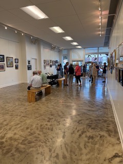
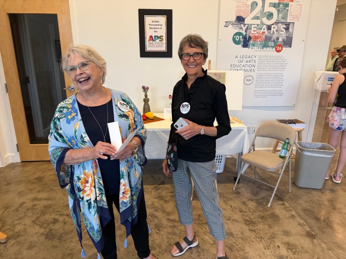
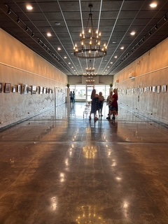
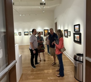
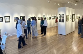
Friday evening’s Arkansas Pastel Society Membership Show at Thea Foundation Gallery in North Little Rock was another wonderful success. A heartfelt thank you to Thea Foundation for hosting our event and for their continued commitment to the arts. Their mission—to fill the gaps left by underfunded school budgets and help young people build confidence, self-worth, and perspective through creative expression—is one that truly deserves recognition and support.
The exhibition featured more than 60 pastel paintings created by over 20 talented artists. Throughout the evening, the gallery was filled with lively conversation, beautiful artwork, and visitors who took the time to appreciate the incredible diversity of styles and subjects on display.
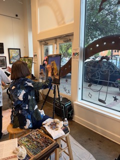
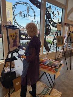
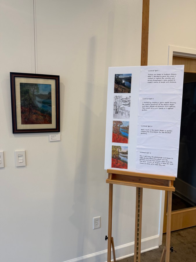
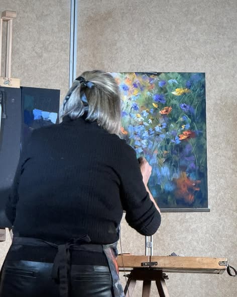
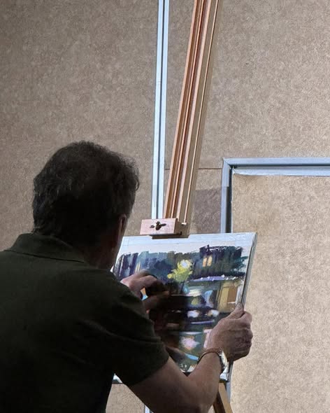
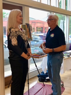
One of the highlights of the evening was watching artists Clarence Cash, Susan Hurst, and Shirley Anderson demonstrate their painting process. Visitors had the opportunity to see a pastel painting evolve from a blank sheet of paper into a nearly completed work of art—a fascinating experience for both artists and non-artists alike.
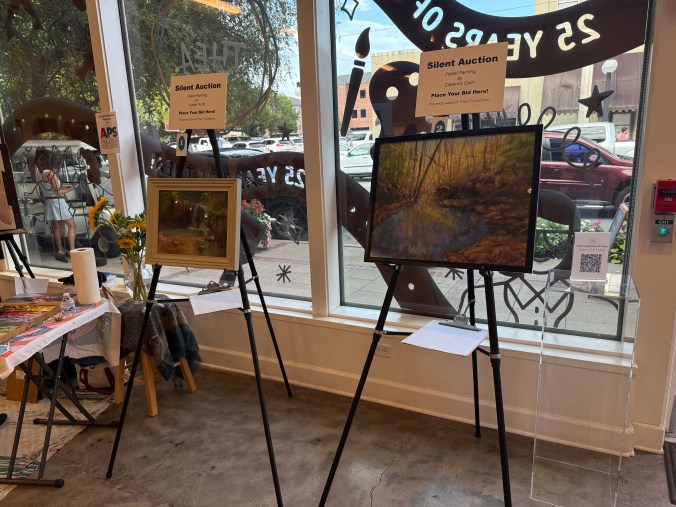
The event also included a silent auction featuring two donated paintings, as well as a hands-on pastel station where guests could experiment with the medium for themselves. It was wonderful to see so many people discover the vibrant colors and unique qualities of pastel.
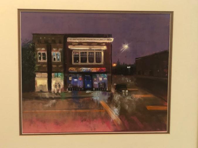
Visitors were invited to vote for their favorite painting in the People’s Choice Award. Congratulations to Virginia Miller for winning with Tribute, and to Georgia Chastain, whose beautiful painting Evening at Vino’s earned a close second-place finish.
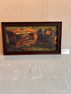
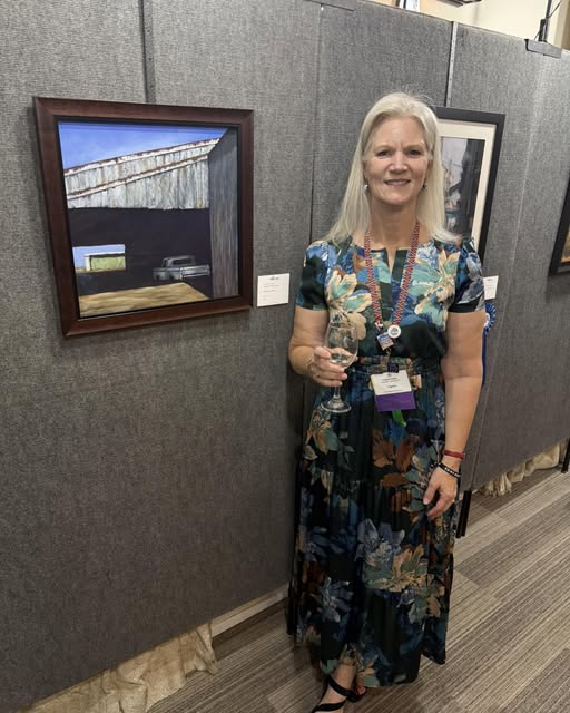
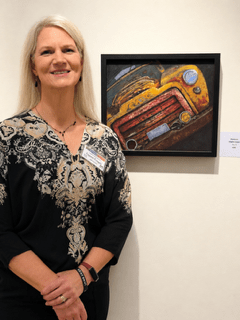
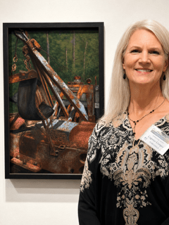
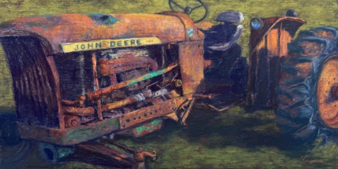
I was pleased to exhibit two of my own paintings, Nothing Runs Like a Deere and The Last Load. It’s always rewarding to share my work alongside such a talented group of artists and to visit with fellow artists, collectors, and art enthusiasts throughout the evening.
Events like these are only possible because of the many volunteers who generously give their time and energy. Thank you to everyone who helped organize, set up, greet visitors, and make the evening run so smoothly. It was especially gratifying to see so many Arkansas Pastel Society members come together to celebrate art, creativity, and our growing pastel community.
The International Association of Pastel Societies (IAPS) PastelWorld Convention was held in Albuquerque, New Mexico, from June 16–21, and what an incredible week it was! More than 650 artists representing 12 countries and every U.S. state gathered to celebrate the beauty and versatility of pastel. It was an inspiring opportunity to reconnect with friends, meet artists from around the world, learn from exceptional instructors, and immerse ourselves in everything pastel. There were so many activities that it is hard to pare them down:
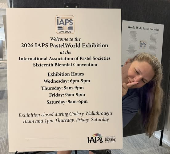
PastelWorld Exhibition – One of the week’s most prestigious events was the PastelWorld Exhibition, featuring 175 outstanding artists from around the globe. I was deeply honored that my work was accepted into this internationally juried exhibition. The PastelWorld Exhibition would not have been possible without the dedication of our amazing volunteers. Nearly 60 volunteersgave their time and talents to help make the exhibition a success—from receiving and hanging artwork to greeting visitors, assisting artists, and helping with countless behind-the-scenes tasks.
Opening Reception & Awards Ceremony – The convention officially kicked off with the PastelWorld Opening Reception and Artist Awards Ceremony. Awards were presented in both the Open Division and the Master Circle Division, which recognizes artists who have earned Master Circle status through consistent acceptance into juried exhibitions and award recognition. Beyond Master Circle, artists may continue earning points toward the distinguished Eminent Pastelist designation.
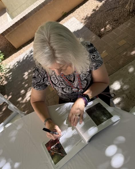
Artist Autograph Book Signing – One of my favorite traditions is the Autograph Book Signing. It’s a wonderful opportunity to meet artists whose work you’ve admired for years and collect signatures. I was especially honored to be included in this year’s book.
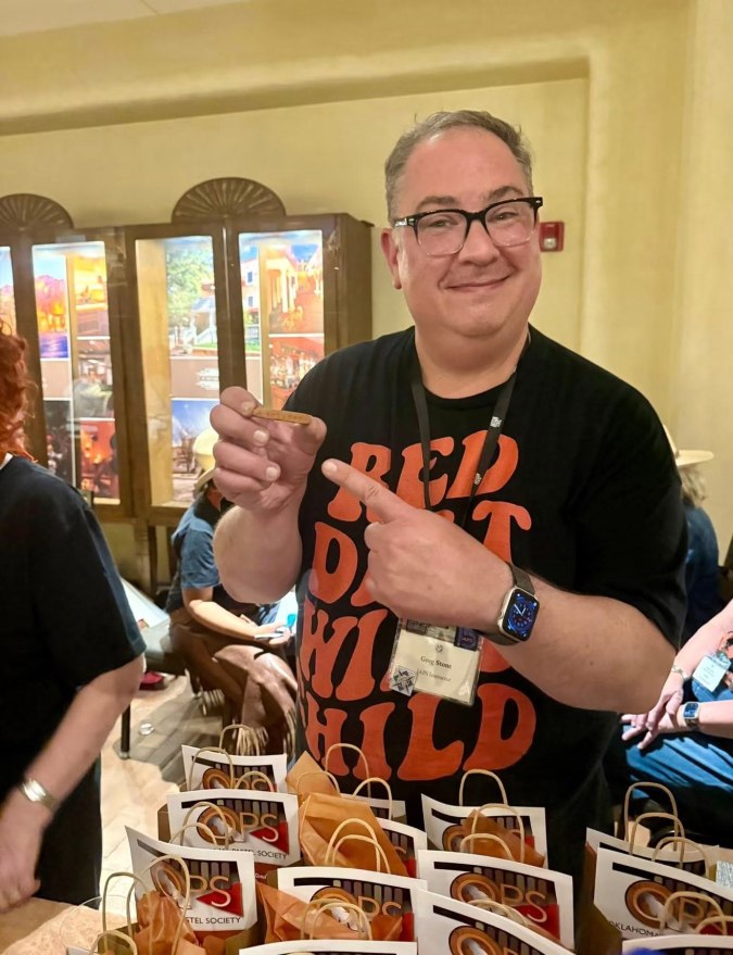
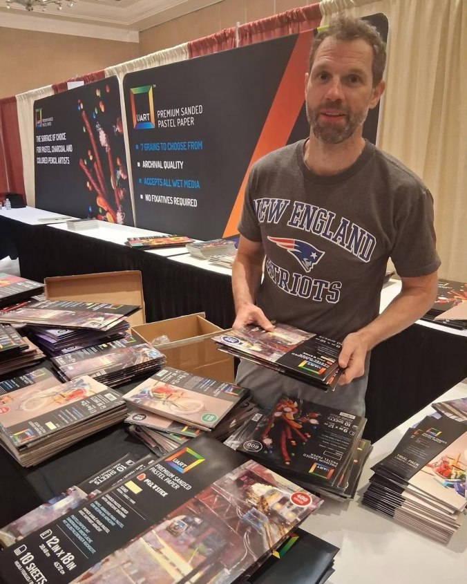
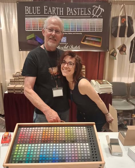
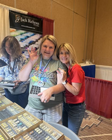
The “Candy Store” – The vendor hall—affectionately known as the “Candy Store.” Filled with the latest pastel brands, premium papers, tools, and accessories, it offers artists the chance to try new products before purchasing them. Needless to say, I found plenty of treasures and definitely put a dent in my wallet!
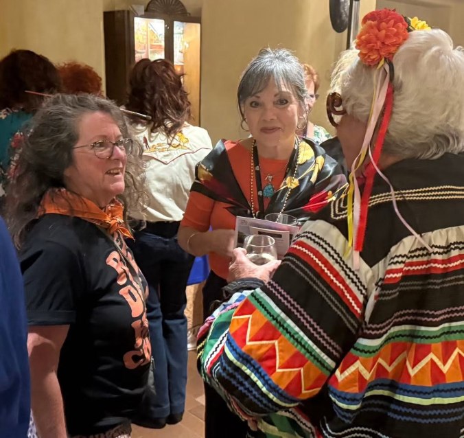
Fiesta Night – Fiesta Night is always a favorite event, bringing together pastel societies from around the globe for an evening of fellowship, conversation, and celebration. Each group represents their state our country in a unique way. There is even a costume contest.
Honors Banquet – The convention concluded with the Honors Banquet, where we celebrated our volunteers, Master Circle and Eminent Pastelists, and recognized those whose dedication has helped grow and strengthen the pastel community around the world.
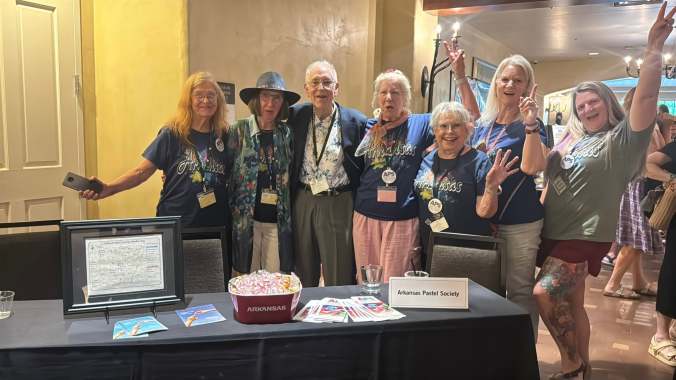
Arkansas Proud – We had a wonderful group of artists in attendance from both the Arkansas Pastel Society and the Ozark Pastel Society. Our state had much to celebrate, with two members from each society receiving Honors Awards in the PastelWorld Exhibition. In addition, two members of the Arkansas Pastel Society are now serving on the IAPS Board, continuing Arkansas’s strong presence and leadership within the international pastel community.
A New Chapter – One of the most memorable moments of the convention was the announcement of the newly elected IAPS Board of Directors. I am deeply honored and humbled to have been elected Vice President of the International Association of Pastel Societies.
This is an opportunity for me to combine my business experience with my passion for art. Serving IAPS allows me to support pastel societies around the world while helping create opportunities for artists to learn, exhibit, and grow. I look forward to working alongside an outstanding board and our many dedicated volunteers as we continue to strengthen our global pastel community.
Before I wrap up, I want to give a special shout-out to my daughter. I cannot thank her enough for the countless hours and incredible effort she put into curating the PastelWorld Exhibition. She has an exceptional eye for arranging paintings in a way that not only creates a beautiful exhibition but also complements and showcases the individuality of each artist’s work. Throughout the week, we heard over and over again how beautifully the exhibition was hung.
In the Love of Art – Caprise
About The International Association of Pastel Societies – The cornerstone of IAPS is our commitment to fostering connections and facilitating the exchange of ideas. We believe that by coming together, we can elevate the art of pastel and support each other in our artistic journeys. We are s dedicated to fostering a global community of pastel artists and advocating for this unique art form.
The past few months have been filled with creativity, connection, and several wonderful opportunities to share artwork with the community. I had the privilege of participating in three gallery exhibitions, each offering a unique experience and reminding me why I love being part of the art world. Two of those shows I experienced the joy of sharing the experiences alongside my daughter and fellow artist, Evelyn Laurence. Here are a few highlights from each event.
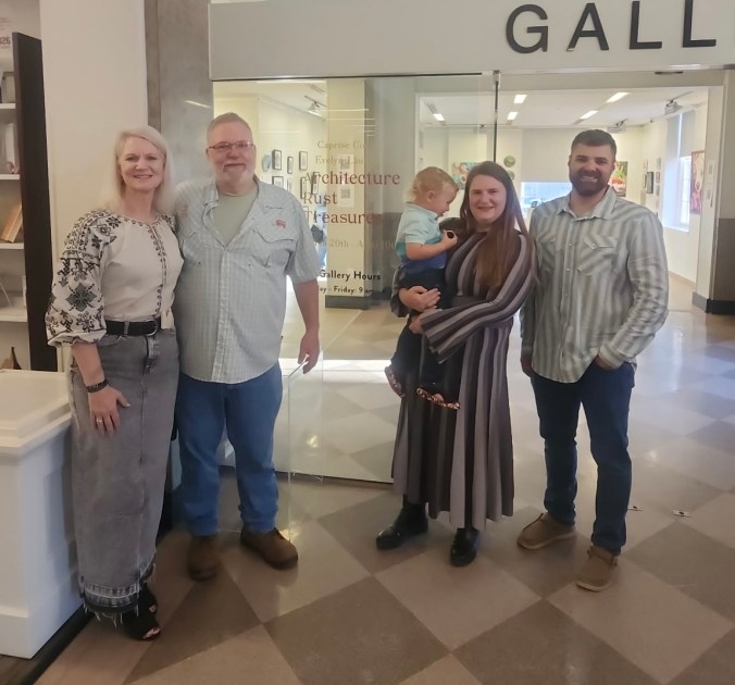
Architecture – Rust – Treasures: Rialto Gallery, Morrilton AR for the Month of May
It was truly an honor to bring Architecture – Rust – Treasures (ART) to the town we call home. Sharing this exhibition in Morrilton made the experience especially meaningful, allowing friends, family, and local supporters to experience the work firsthand.
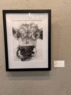
One of the highlights of the exhibition was seeing visitors connect so personally with the artwork. Guests were invited to vote for a People’s Choice favorite. Evelyn’s “Oh Moo” and my “Nothing Runs Like a Deere” were selected.
In Full Color: Arts on Main, VanVuren, AR from May 5 through June 27
This exhibition showcases works by members of the Ozark Pastel Society (OPS) and Arkansas Pastel Society (APS), featuring work by artists ranging from those new to the pastel medium to those who have earned the highest honors from the International Association of Pastel Societies (IAPS) and the Pastel Society of America.
One of the most inspiring aspects of the exhibit was the sense of community and encouragement shared among the artists. My friend and fellow artist Charles Peer expressed it beautifully:
“Each painting added to the beauty of the exhibit. One of the things I loved about our collection of work is that all the paintings, no matter if this is the artist’s first time to exhibit or their 500th, were proudly hung next to each other. This is such a beautiful visual expression of what friends’ support, encouragement, camaraderie, respect and growth looks like!”
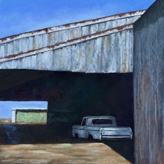
Architecture, Rust, Treasures (ART) is an exhibition that explores the wonders of nature and the hidden treasures found within the landscapes that connect us. This collection reflects a shared passion for discovering lost, weathered, reclaimed subjects and reimagining them as something new.
ART is a mother-and-daughter exhibition that celebrates the beauty hidden in our world, from forest finds to overlooked architectural details. Through a variety of compositions and subjects, the artists express a deep appreciation for history, transformation, and the stories objects and places hold over time.
This is the time of year to pause and reflect. As I look back on the past year, I think about my art journey and ask myself some important questions: What did I paint? Did I try anything new? Did my work grow? And did I give back to my art community?
Experimenting & Learning
Experimentation continues to be a driving force in my work. While painting on canvas works well and helps me use the many canvases I have on hand, I’ve realized it doesn’t always produce the results I’m looking for.
One big win this year was priming paper with micaceous iron oxide acrylic and terra cotta pastel ground. The warmth and texture are a beautiful complement to the green landscapes I love to create.
I also discovered that both metallic watercolors and metallic acrylics work well for the underpainting of the truck, adding depth and interest early in the process.
Perhaps one of the most important lessons I’ve learned is knowing when to step back. When I reach the end of a painting, it’s important to give it time to breathe and not rush to call it finished.
Giving Back
Giving back to the art community has been one of the most rewarding parts of my year.
Sharing what I’ve learned with members of the Ozark Pastel Society and the Arkansas Pastel Society
Teaching at LifeQuest of Arkansas
Serving as President of the Arkansas Pastel Society
Each of these experiences brings me great joy. I learn so much from the artists I interact with, and teaching and leadership continually reinforce and strengthen my own skills.
Accomplishments
Winning awards is certainly an acknowledgment that the work I’m producing is strong—in composition, value, color, ability to draw the viewer in, and whatever else a judge may see. I’ve learned to soak in those moments, appreciate it, and then continue painting.
Not every painting can be a winner. Some end up in the trash or painted over entirely—and that’s okay. We are always learning.
My Favorite Paintings This Year
I get the most joy from painting scenes that capture a fleeting moment—ones that stir emotion, spark a memory, and invite the viewer into a quiet conversation with the scene.
Thank you for joining me on this journey. Your support and encouragement are powerful motivators, and I’m grateful to share this path with you.
Introduction Soft pastel artists know that paper is just as important as the pastel itself. The right surface can elevate a piece by allowing your unique style and technique to shine through. With the incredible variety of pastel papers available—featuring different textures, colors, and weights—it’s easy to become overwhelmed. That’s why I ordered the Sample Pack from Dakota Pastels: to explore new options and see how each paper worked with my mark-making style and painting approach.
What I’m Looking For This review is entirely based on my personal preferences and how well each paper supports my artistic process. Here’s what I focused on:
My mark-making style (how I apply pastel).
The ability to layer pastels and retain vibrant color.
Paper that handles wet media for underpainting (acrylic or watercolor).
The texture and visual finish that the paper provides.
This isn’t a judgment on the overall quality of each paper—some may work beautifully for other artists.
My Testing Approach To ensure consistency in this experiment, I kept several variables the same:
Painted the same scene for each test.
No underpainting: direct painting with minimal blending (which aligns with my typical technique).
Used the same pastel brands: Terry Ludwig, Sennelier, Richeson Handrolled, NuPastel (hard pastel), and a new-to-me soft pastel, J.Luda.
Each test painting was done in 15–20 minutes.
I began with papers I’ve used in the past to “warm up,” then moved on to unfamiliar surfaces.
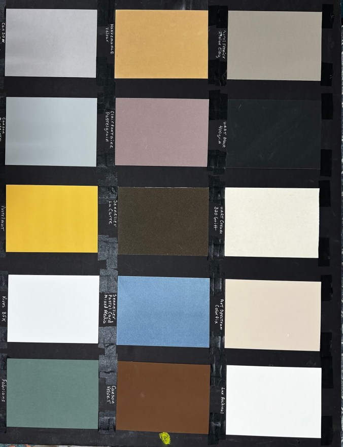
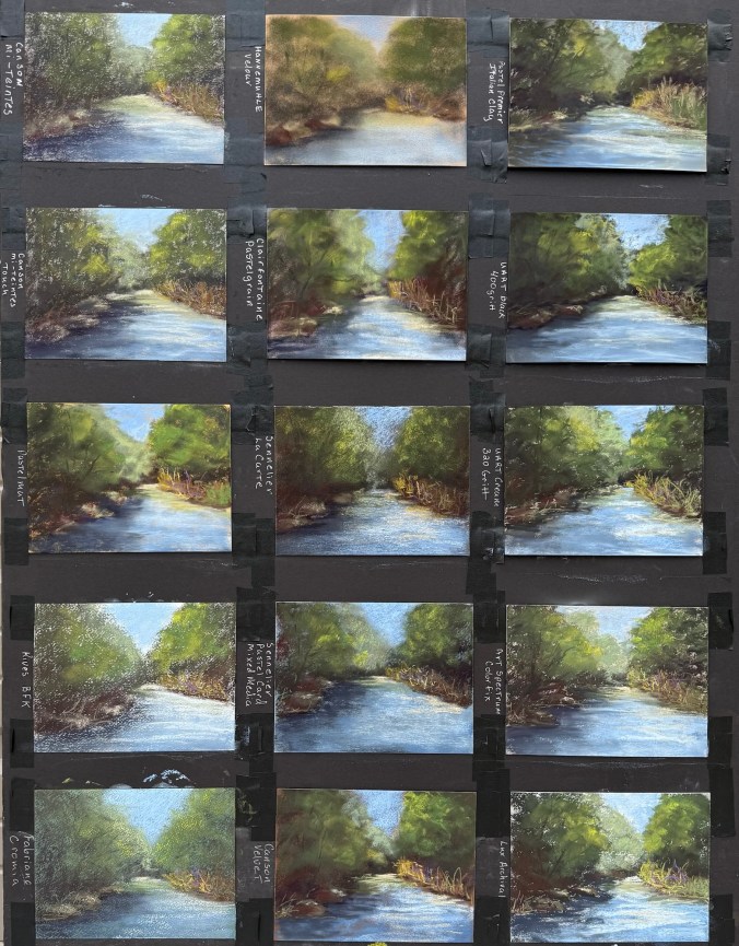
My Results (Starting from Top Right of the Sample Pack, Moving Down)
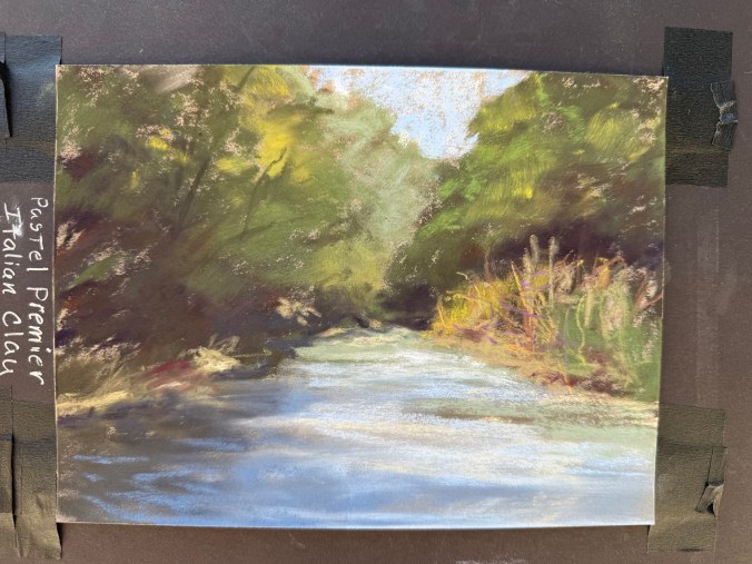
1. Pastel Premier – Italian Clay USA | 100% cotton | Medium tooth aluminum oxide grit | 310gsm | Wet media friendly A reliable favorite. Durable with a great tooth for layering, it handles strong mark-making and almost behaves like a sanded surface. I enjoy this paper for its durability and consistency. Be mindful: the paper color impacts the overall tone. Great for landscapes and rusty vehicles.
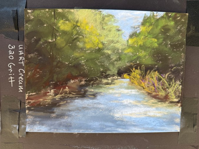
2. UArt – Cream, 320 Grit (Coarse) Germany | Sanded surface | 200 grit course to 800 grit fine | Wet media friendly My go-to paper for years. The coarse grit grabs pigment incredibly well, allowing deep layering and vibrant texture. It is best to use hard pastels like Rembrandt or NuPastel for your base layers, as soft pastels will be used up quickly. The paper can curl, but flattens easily. I’ve used this paper for landscapes and rusty vehicles.
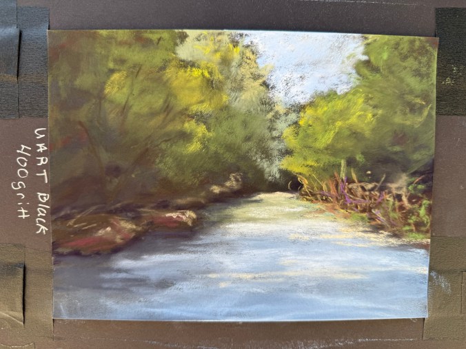
3. UArt – Black, 400 Grit (Medium) Same durable performance as Paper #2 but in black and slightly finer grit. The black surface intensifies color vibrancy and subtly blends tones. A noticeable shift in mood and contrast between this and the cream version. I’ve used this paper for rusty vehicles, and I can see using it for future landscapes.
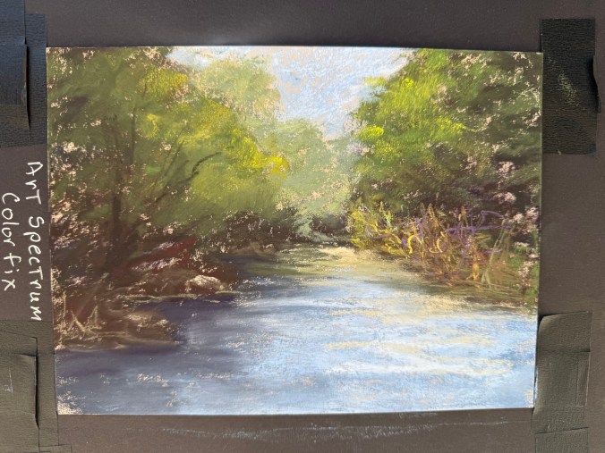
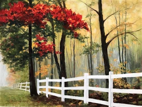
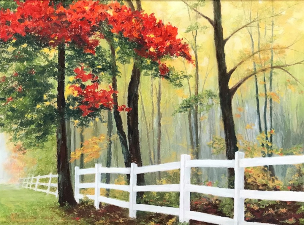
4. Art Spectrum Colourfix – Cream Australia | Acrylic-primer on watercolor paper | Medium tooth | 300gsm | Wet media friendly It’s been years since I used this paper, and it pleasantly surprised me. Good texture, not too hard on pastels, and lots of layering potential. Available in many colors—great for creative paper integration in your design. Some of my favorite landscapes were created on this paper like Komorebi (see painting with red leafed trees below), allowing the yellow paper to show through. I have not used this paper on rusty vehicles as I don’t believe it is gritty enough.
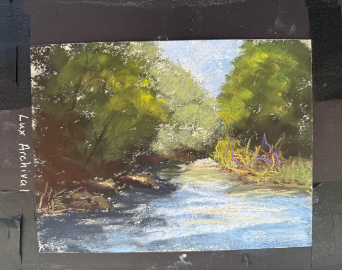
5. LuxArchival France | 100% cotton | Medium/coarse tooth | 300gsm | Wet media friendly Gritty to the touch but goes on smoother than expected. This is a strong contender for future landscape and rusty vehicle work. It held pastel well and delivered clean layering. I actually have larger sheets of this paper, just haven’t gotten around to using it.
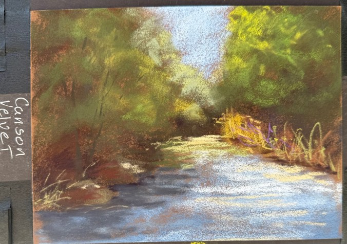
6. Canson Velvet France | toned paper with a velvety finish | 430gsm | Wet media friendly Though it doesn’t feel “velvety” to the touch, pastels glide smoothly over it. Rich color retention, softer final look. The pastel fills the tooth consistently, and it covers the paper well. NuPastels glide over the paper, so I needed to adjust my pressure to make the marks. Blending required a bit more pressure. The velvet left more texture than I expected. Possibly a great choice for animal portraits.
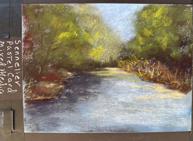
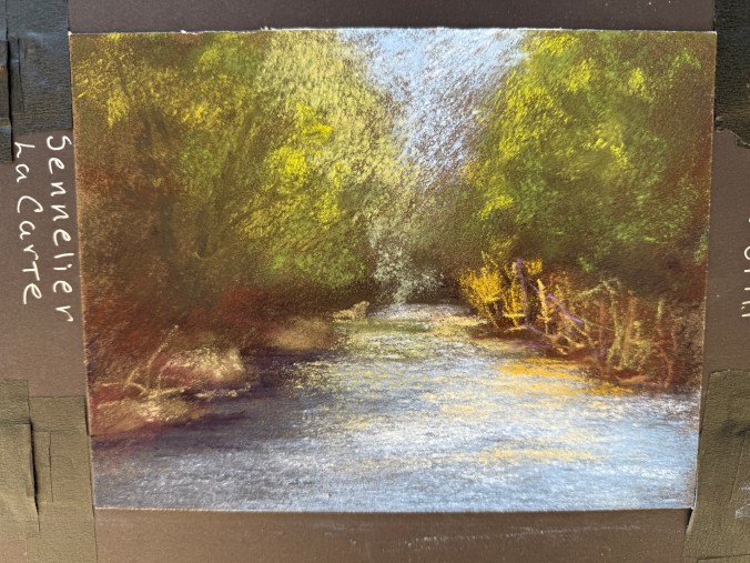
7. Sennelier La Carte Pastel Card – Mixed Media France | coated in a fine layer of cork powder for a light grain | 410gsm | Water and solvent resistant Rough surface with unique texture—not like sanded paper. The paper didn’t chew through the pastels, but I didn’t fill the tooth (on purpose for consistency). I may wash the paper and try mixed media.
8. Sennelier La Carte Pastel Card France | coated in a fine layer of cork powder and vegetable flakes |medium surface | 360gsm | For dry media only This didn’t work well for my style for landscapes—left a grainy look due to how I apply pastel. It might work for rusty vehicles.
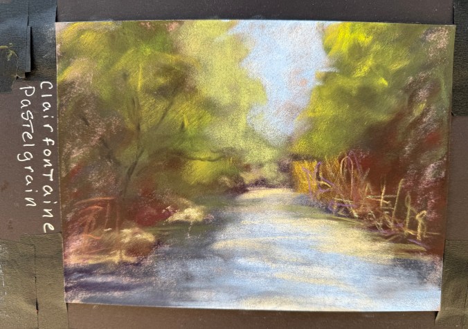
9. Clairefontaine – Pastel Grain France | 360gsm | Wet media friendly Lightly textured and soft-looking, especially when blended. Nice velvety finish when blended. It may be great for delicate subjects like pet portraits.
10. Hahnemühle Velour Germany | Synthetic fibers | 260gsm Truly feels like velveteen rabbit fur! Very soft surface that holds lots of pastel. Produces a romantic, dreamy look—ideal for soft subjects like animal portraits.
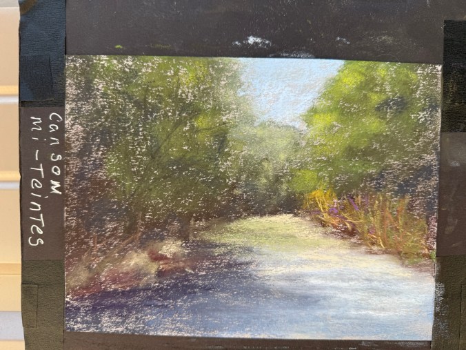
11. Canson Mi-Teintes France | 160gsm | Honeycomb texture one side, fine grain other | I don’t believe this paper can get wet Not ideal for layering—pastels get muddy fast. Needed to blend more than I usually do as the pastel didn’t cover well. This paper didn’t suit my technique well.
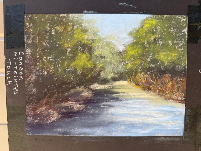
12. Canson Mi-Teintes Touch France | Micro-abrasive coating | Wet media friendly Very different from the original Mi-Teintes. I found layering difficult—colors muddied instead of building cleanly. This paper didn’t suit my technique well.
13. Pastelmat France | Unique synthetic surface | 360gsm | Wet media friendly Varied response depending on pastel brand—some went on velvety, others gritty. Required quite a bit of blending. It holds the pastel well, but may need some technique adjustments.
14. Rives BFK France | 100% cotton | Printmaking paper While absorbent and soft, it didn’t support my pastel technique well. Even Terry Ludwig’s darkest shades looked faint. When I did some research, this is a printmaking paper, and it doesn’t work well with my style. Maybe a blended underpainting would solve the issue of the texture showing through.
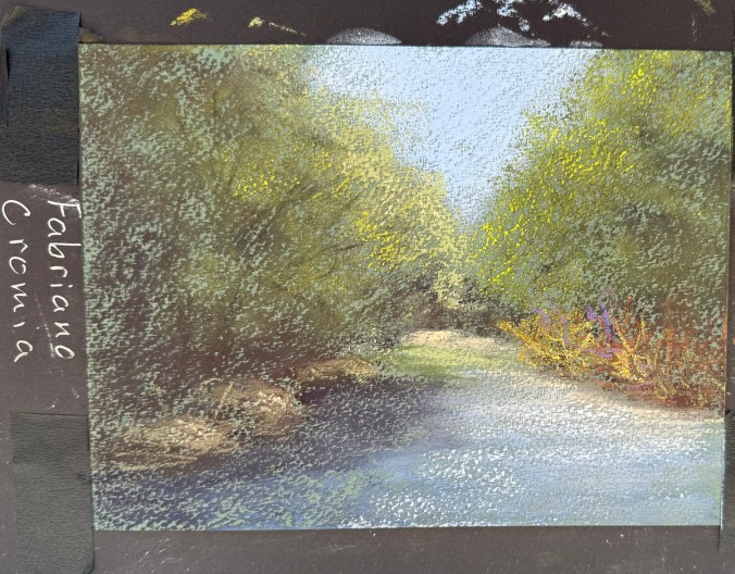
15. Fabriano Cromia Italy | 50% cotton and 50% alpha-cellulose | 220gsm | Light wet media Very similar to Rives in feel and performance. It would likely benefit from underpainting to combat paper texture showing through.
Final Thoughts Exploring this wide range of pastel papers was enlightening. Some surfaces reaffirmed my continued use of Pastel Premier, UArt, and Art Spectrum; others surprised me, and a few didn’t suit my process, but may work well for artists with different styles or subject matter. I’m excited to revisit a few LuxArchival, Sennelier LaCarte Pastel Card Mixed Media, and Sennelier LaCarte Pastel Card with a more tailored approach and see what evolves.
If you’re thinking of trying a new paper, I highly recommend getting a sample pack and putting each one to the test. You never know what might become your next favorite surface!
As an artist, one of the most rewarding aspects of my practice is the opportunity to participate in juried shows—both online and in-person. Every year, I submit my work to a variety of competitions and exhibitions, where my art is evaluated alongside that of many talented peers. For me, simply being accepted into these shows is an honor in itself.
In some cases, these competitions feature over 100 artists and hundreds of pieces of artwork, all vying for attention. With so much talent on display, the process of being selected feels like an affirmation that my art is heading in the right direction. It reassures me that I am continuing to grow, both in my skills and in my ability to connect with viewers—whether that’s the show jurors or the audience who sees my work for the first time.
But, of course, not every submission results in an acceptance. And that’s okay. At the heart of my creative process is passion, and no rejection can ever take that away. For me, art is about self-expression, discovery, and the joy of creation. Whether or not my pieces are selected, the act of making art is always a rewarding experience in itself.
April 18A Pinch Me Moment: Juried into IAPS 2025 Spring Web Show – 46th Open Division
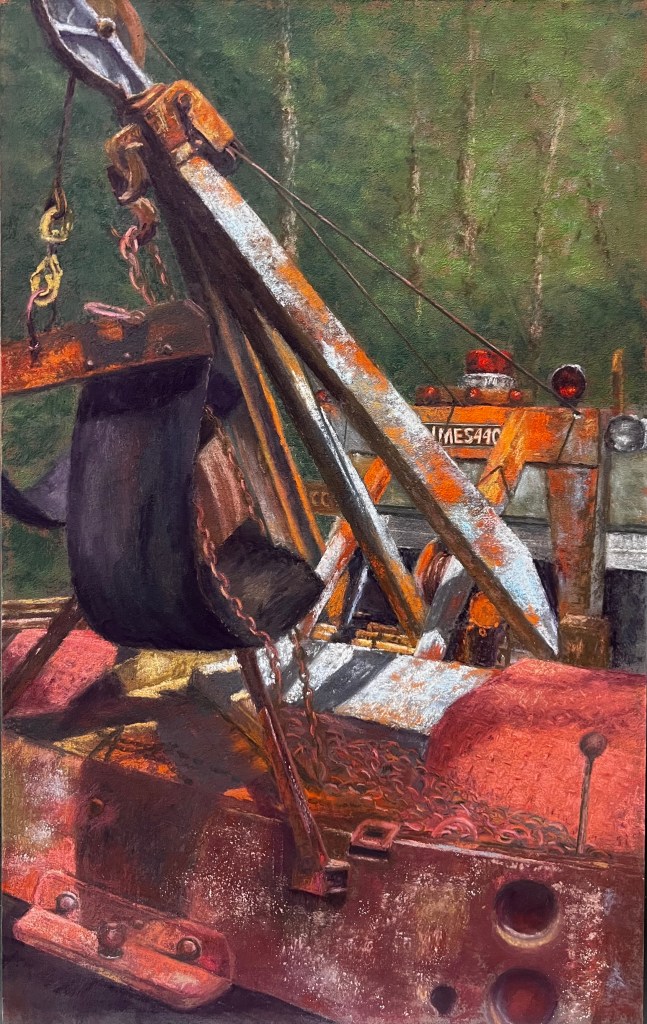
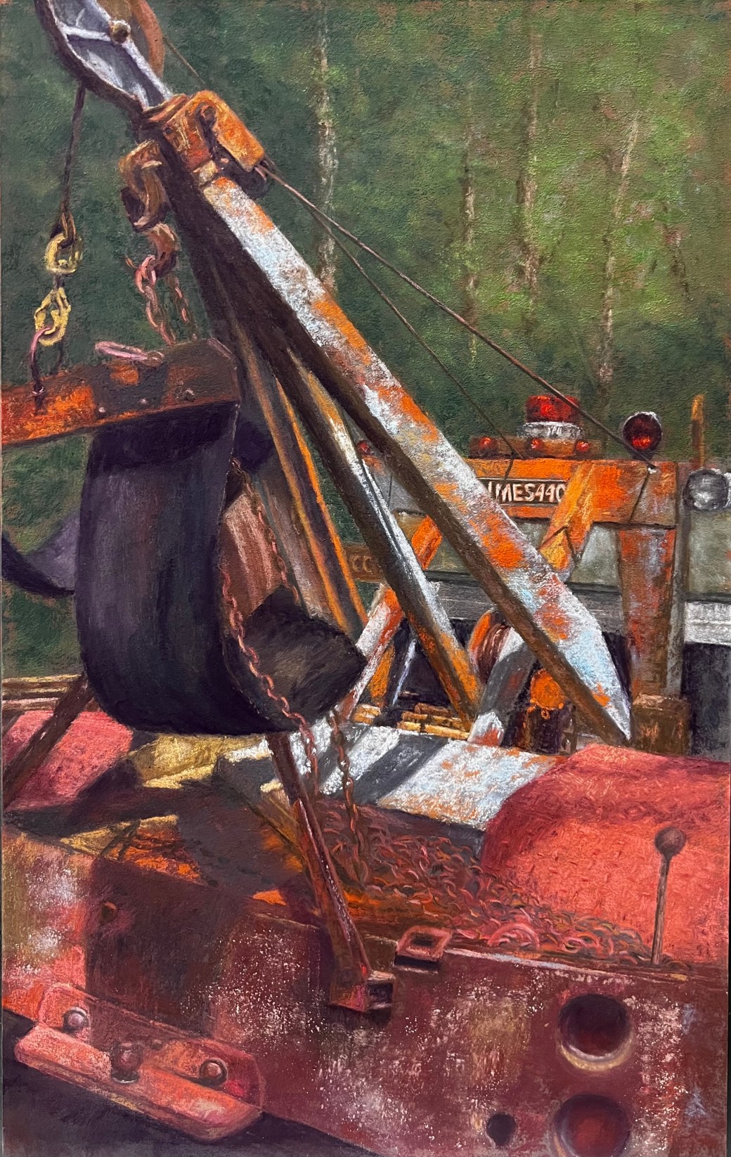
I am thrilled to announce that my painting, Holmes 440 Wrecker, has been accepted into an International Association of Pastel Societies (IAPS) juried exhibition! For those unfamiliar, IAPS unites pastel societies worldwide to support and promote the fine art of pastels. Being selected for such a prestigious international show is both an honor and a significant milestone in my artistic journey.
While I did not receive an award in this particular exhibition, the acceptance itself is a testament to the quality and appeal of my work. Each acceptance into an IAPS juried exhibition earns one point toward the IAPS Master Circle designation. To achieve this honor, artists must accumulate five points, which can be earned through acceptances and awards in IAPS juried exhibitions.
Achieving Master Circle status is a significant accomplishment, and I am excited to be on the path toward this goal. While it may take time to accumulate the necessary points, each step forward is a rewarding experience that fuels my passion for pastel painting.
Thank you to IAPS for this incredible opportunity, and to all who have supported me along the way.
A Special Achievement: Honorable Mention in the Dakota Pastels First Quarter Competition
This year has been particularly exciting, as I received an Honorable Mention for my painting Holmes 440 Wrecker in the Dakota Pastels First Quarter Competition. It was a humbling experience to have my work recognized among so many other talented artists.
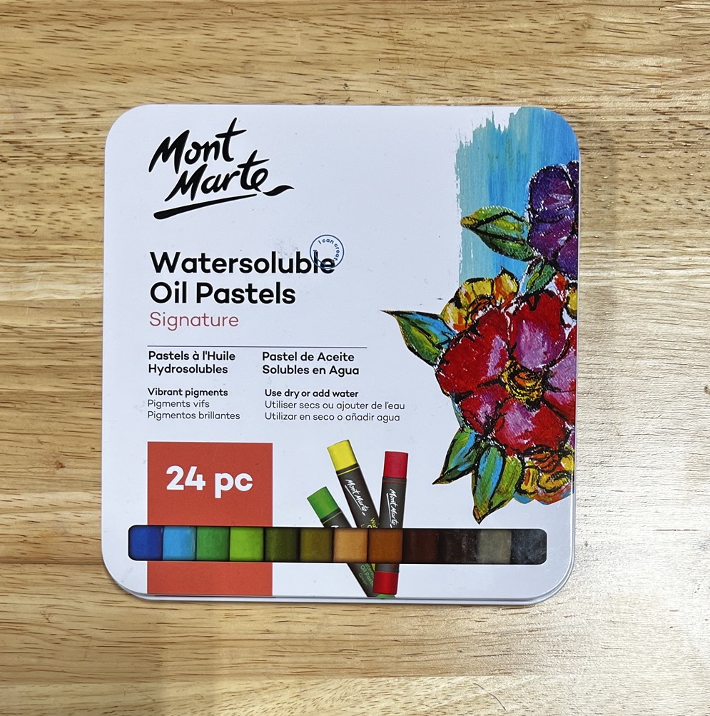
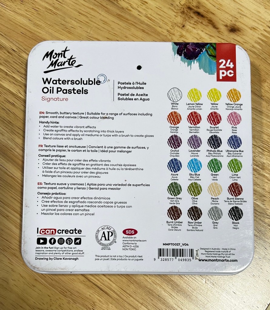
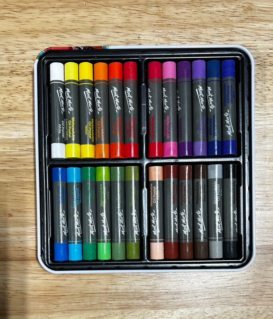
This was my first time using oil pastels, so I approached this new medium with curiosity and a bit of caution. As a soft pastel artist, my process typically involves creating an underpainting to guide the application of pastels, establishing lights, darks, and local colors. I was intrigued by the potential to incorporate the oil pastels into my underpainting process. Here’s how it went!
First Impressions & Application:
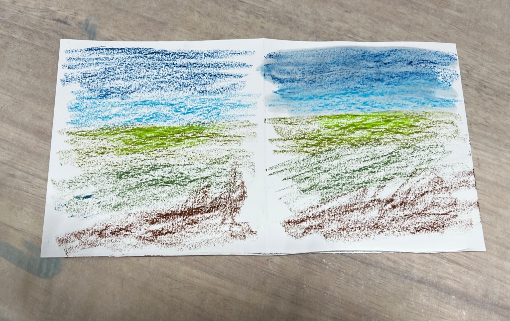
I began with a simple landscape underpainting on UArt 500 grit sanded paper. The initial application revealed some interesting characteristics:
• The colors were vibrant and laid down smoothly, I noticed that the pastels occasionally left small chunks. This could be due to the sanded surface or my unfamiliarity with the pressure needed for even application.
• The pastels blended effectively with a brush, as recommended on the box. I also experimented by overlapping colors in the sky.
Blending Experiment – Water vs. Alcohol:
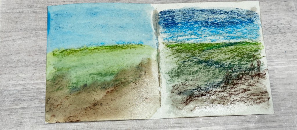
According to the product instructions, water or other oil painting mediums could be used to wash the pastel. To compare the effects, I used water on the left side and alcohol on the right:
• Water was more effective in dissolving the pastels, creating a smoother and more fluid wash.
• Alcohol resulted in a slightly more textured effect, with some areas retaining more pigment.
Testing on Different Surfaces:
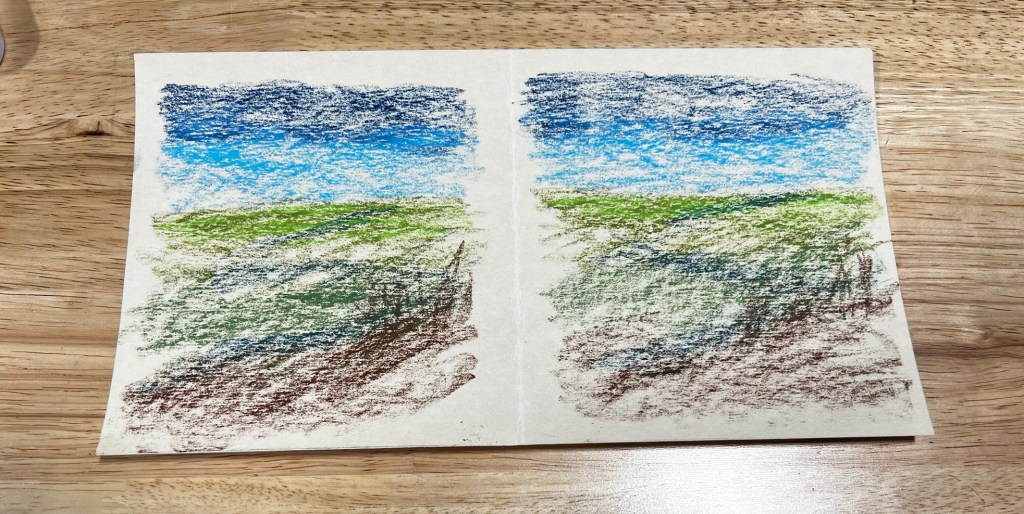
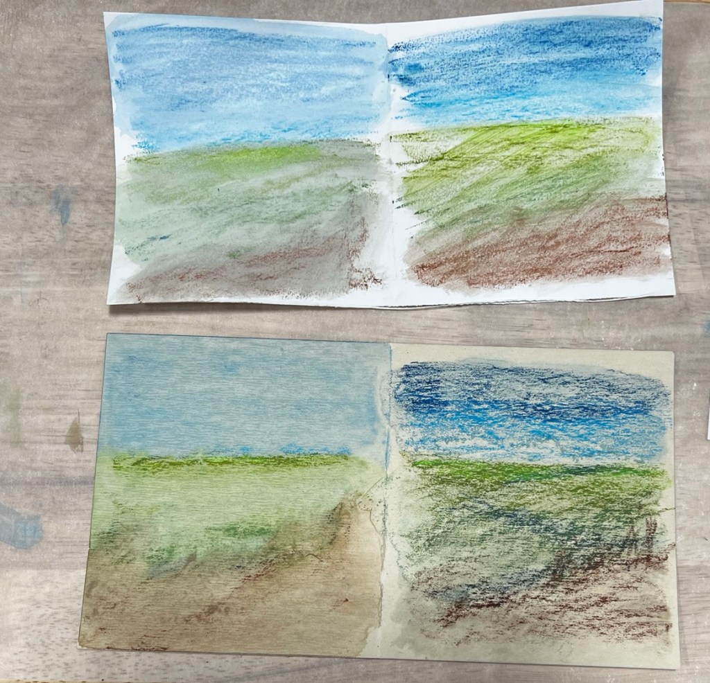
To see how the pastels would respond to a smoother surface, I repeated the process on Strathmore Mixed Media 300 Series paper. This yielded different results:
• The application was smoother, and the pastels blended a bit more easily.
• Both papers worked well, but I preferred the UArt sanded paper for the style of paintings I create, as it added more texture and depth to the underpainting.
Layering with Soft Pastels:
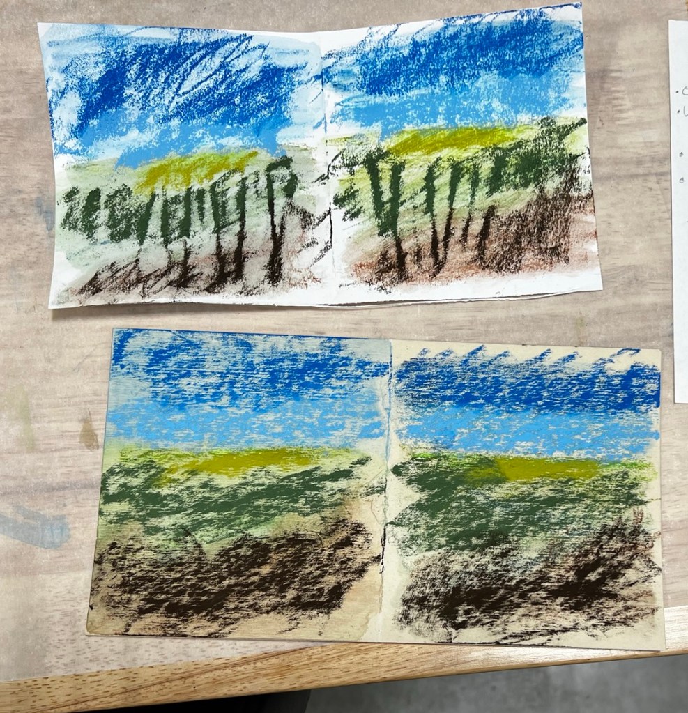
Once the underpaintings dried, I applied soft pastels over the top. The results were promising:
• The washes dried to muted tones, providing a subtle and harmonious base for the soft pastels.
• The soft pastels adhered nicely without any interference from the oil pastel underpainting.
Final Thoughts:
The water-soluble oil pastels offered a new way to create an underpainting. I will continue exploring this technique in future soft pastel paintings. If you’re a soft pastel artist looking for a new way to approach underpaintings, these water-soluble oil pastels are worth a try.
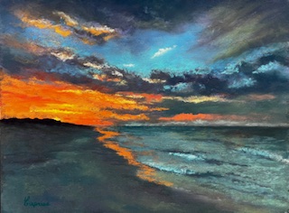
It was an honor to be asked by Leafy Cheung of Artmate, an Art Material Manufacturer, to use and provide feedback on several brands and types of pastel. Here is a painting I created with Oufin Soft Pastels and my feedback about this set.
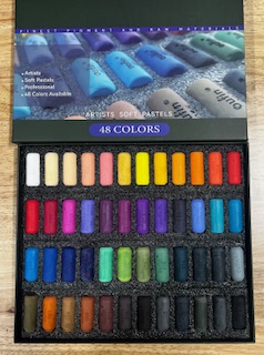
Oufin is a lesser-known brand to me, but I was pleasantly surprised by the quality of their 48-piece soft pastel set. Striking a balance between hard and soft pastels, these half-stick pastels offer smooth, consistent density without sharp edges from machine marks.
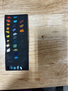
One feature I particularly enjoyed was the absence of wrappers, making the pastels ready for immediate use. For those who like to stay organized, the sticks are stamped with color numbers—perfect for creating a color chart.
The application was buttery and smooth across the board, though, like most sets, there were minor inconsistencies: yellow was slightly softer, and red had a bit of grit. Still, the overall quality was impressive.
With the color and value range provided, I completed a painting, needing only a few additional sticks from my sets: an extreme dark and a trio of turquoise values.
For its size, quality, and price point, the Oufin 48 Soft Pastel set is an excellent choice for beginners or artists looking for an affordable, versatile set to explore.
These are the colors I used for the painting. The colors along the bottom are pulled from my own sets.
First, I want to thank all those who have supported my journey. This includes my husband, family, fellow artists, instructors, and others who engage with me on social media. Your encouragement, constructive critiques that help me grow, and interest in my process motivate and inspire me.
Here is a look back on 2024:
The highlight of my year was attending the International Association of Pastel Societies (IAPS) convention in New Mexico. This magical event brought together over 500 artists from across the globe. There were workshops, networking opportunities, and an art supply store. It was also my first trip to New Mexico.
I purchased several new art supplies at IAPS, some of which I’d never used before. Experimenting with these has been exciting and has enhanced my technique for painting rusty vehicles.
My daughter and I showcased our “Generations” art exhibition at the Rialto Gallery in Morrilton, Arkansas. It was also held at Argent Gallery in North Little Rock in December 2023.
My painting “Mater” was auctioned off at the Community Service Inc. annual charity event. It was an honor to donate this painting for such a worthy cause.
I attended a workshop by Nancie King Mertz and have been practicing the valuable techniques I learned.
My daughter and I collaborated on a mural at a private home featuring the Arkansas Razorback – “Woo Pig Sooie.”
One of my goals was to salvage two “dud” paintings from a 2023 workshop. This exercise was both challenging and rewarding.
Reflecting on the past year has provided valuable insights that will guide me as I plan for 2025. The best part? I am now retired from the corporate world, allowing me more time to paint!
Serve as President of the Arkansas Pastel Society (APS).
Plan, paint, and prepare for the next mother-and-daughter show in March 2026.
Continue teaching one-on-one art sessions, which I began in December 2024.
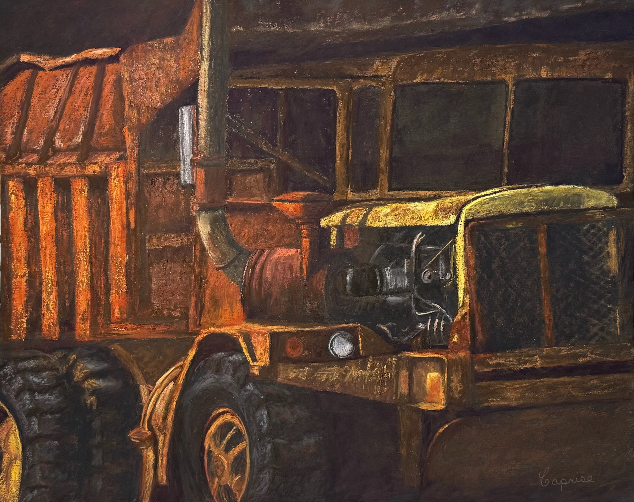
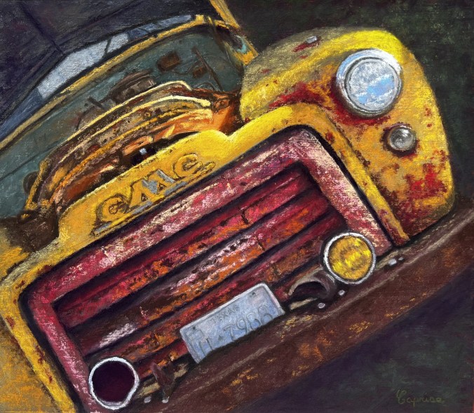
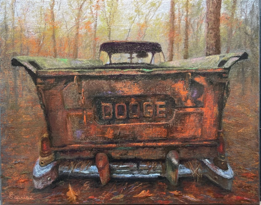
Expand my rusty vehicle series, experimenting with textures and new materials.
Explore the idea of creating an abstract painting inspired by the unique rock formations on Petit Jean Mountain. These formations share qualities with the colors and textures of my rusty art. I’m excited to see where this journey takes me.
What are you most excited about in your plans for 2025?
During this Thanksgiving, I find myself reflecting on all the blessings in my life with a grateful heart. This year feels especially meaningful, as it’s my second month of retirement—a new chapter that’s already brought so much joy, freedom, and creativity.
I’m deeply thankful for my family, friends, faith, and good health. These pillars of my life have carried me through every season. Having more time now allows me to cherish these relationships even more and soak in the small, meaningful moments that truly matter.
I’m also incredibly thankful for my art and the vibrant community surrounding it. My creative journey has been such a source of fulfillment, and it’s humbling to share my work with you. Your support, encouragement, and enthusiasm for my art fuel my passion every day. I’m grateful to the galleries that showcase my pieces and to the connections I’ve formed with fellow artists who inspire me.
Perhaps one of the greatest gifts is sharing this passion with my daughter and her children. Creating alongside her brings a sense of purpose and joy that words can hardly capture. It’s a reminder of how art can connect us in ways that transcend generations and deepen our bonds.
This Thanksgiving, I’m embracing the beauty of this season of life and all the possibilities it holds. Thank you for being part of my journey—I can’t wait to share more with you in the months ahead.
Wishing you all a happy, peaceful, and gratitude-filled Thanksgiving!











 Caprise Cooper Art