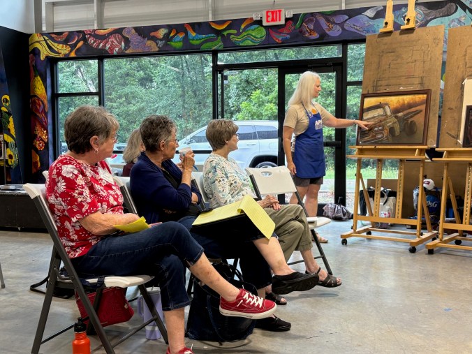
It is an honor to exhibit once again with my daughter, Evelyn Laurence. We’ve been working hard for the last two years to prepare for this show. We cordially invite you to attend the Opening Reception and help us celebrate!
Where: Argenta Library Gallery, 420 Main Street, North Little Rock
When: Meet the Artists at the Opening Reception, March 20, 2026, at 5:00 – 8:00 pm
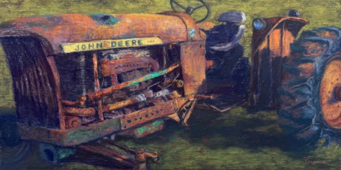
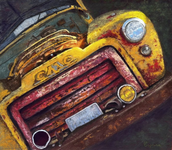
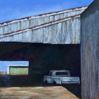
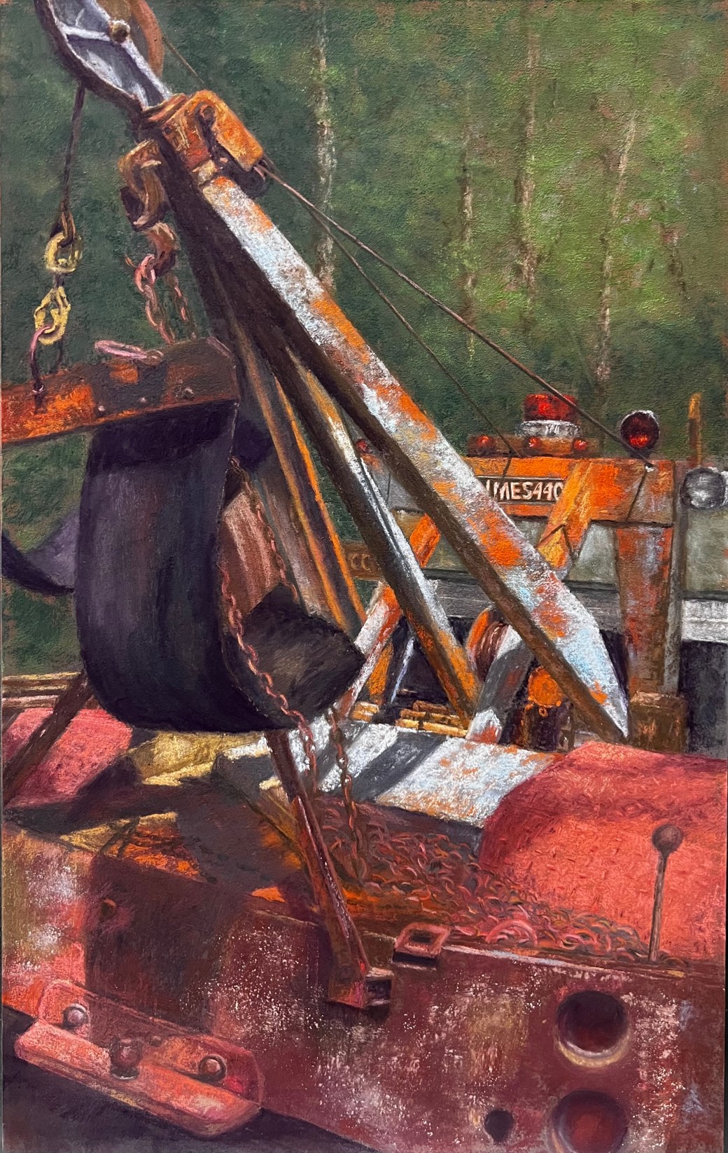
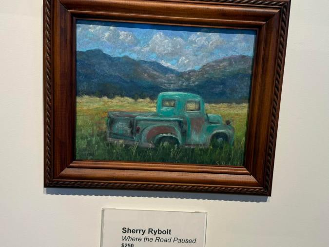
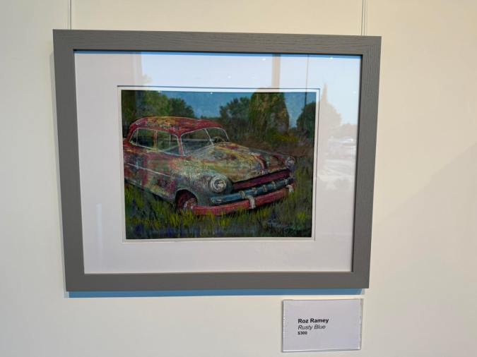
Architecture, Rust, Treasures (ART) is an exhibition that explores the wonders of nature and the hidden treasures found within the landscapes that connect us. This collection reflects a shared passion for discovering lost, weathered, reclaimed subjects and reimagining them as something new.
ART is a mother-and-daughter exhibition that celebrates the beauty hidden in our world, from forest finds to overlooked architectural details. Through a variety of compositions and subjects, the artists express a deep appreciation for history, transformation, and the stories objects and places hold over time.
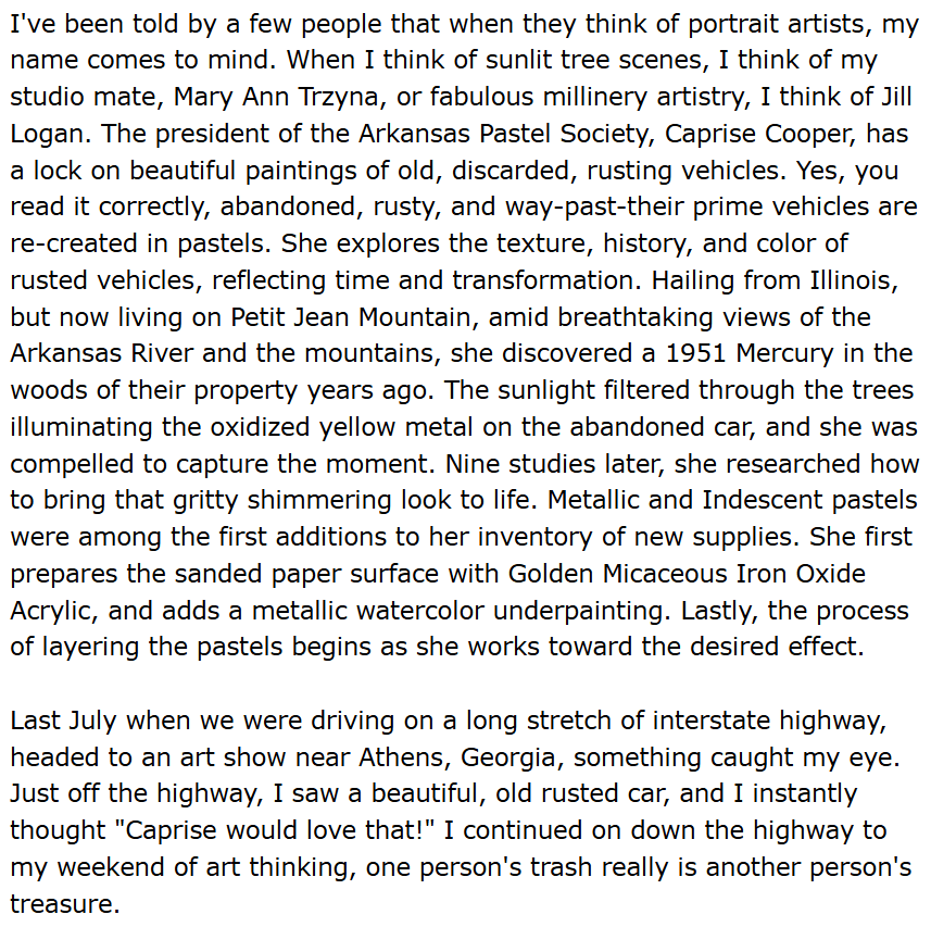
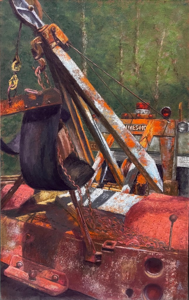
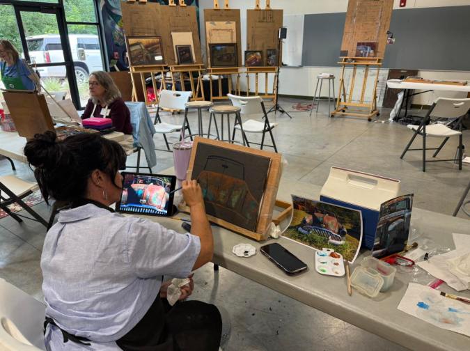
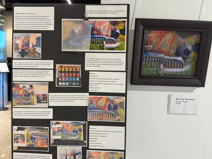
The exhibition features imagery of old structures that have existed for generations, some of which once belonged to our own family. A series of works inspired by rusted vehicles began with a 1951 Mercury converted truck bed discovered on our homestead. The collection moves across pastel, pencil, ink, and acrylic, reflecting the richness and versatility of our artistic voices.
Representing the next generation is seven-year-old Bearrett Laurence, the third-generation descendant of the Cooper family. He will be exhibiting in this show with his third painting, marking the continuation of a family tradition rooted in creativity.
ART is a celebration of imagination, craftsmanship, and the special bond between mother, daughter, and grandson, illustrating how a love of art is passed down through generations. We hope this exhibition—and the stories behind it—leave you inspired, moved, and deeply touched.
The show runs through March 20, 2026 – April 3, 2026. The Gallery is open Monday through Friday from 9 am to 6 pm. Except March 30th and 31st.
It was both an honor and a humbling moment when my friend and fellow artist, Jean Lewis, asked to feature my rusty art in her monthly newsletter. I’m grateful for the opportunity and excited to share the full article here.
I first met Jean several years ago when she entered the Arkansas Pastel Society National Show. We quickly connected — not only through our shared love of art, but also through our Chicago roots. Jean is a native Chicagoan, and I was born in Chicago and raised in the suburbs, which made our connection even more meaningful.
Since then, Jean has joined the Arkansas Pastel Society, and whenever she has a painting included in one of our exhibitions, she makes the trip to be part of it. Her dedication to her work and to the art community is inspiring. I highly encourage you to visit her website and explore her beautiful work.
I am truly blessed to live in a community where several artists reside—ten that I know of so far. Painters, potters, writers, pastelists, and artisans. This year, one of those artists invited us to gather and talk about how we might support one another. During that first meeting, I learned so much about each person’s journey and how art has shaped their lives and the lives of those around them. It was fascinating to hear how different each path was, yet how many common threads emerged: passion, a commitment to learning, a deep yearning to create, and a desire to share our experiences.
The outcome of that initial gathering was a shared agreement that we should continue meeting. Even though our mediums vary, there is so much we can offer one another across disciplines—how we work through artist’s block, the courage to try a new medium, opening our studios so we can experiment together, and opportunities for shows, just to name a few. We are still defining our purpose and even deciding on a name, but the foundation feels meaningful and strong.
I’m very much looking forward to our next meeting.
Wishing you all a safe, happy, and prosperous New Year! Recently, I reflected on the joys and gratitude of the past year, and now I’m excited to share what’s ahead. I’m looking forward to the serendipitous moments that unfold along the way, opportunities to gather with fellow artists, plenty of experimentation, and the lessons that come with it all.
I’m honored to serve a second term as President of the Arkansas Pastel Society (APS).
I’ll also continue paying it forward by teaching at LifeQuest of Arkansas.
I’m especially excited to once again exhibit alongside my daughter in Architecture • Rust • Treasures at the Argent Library in Little Rock, Arkansas.
Opening Reception Friday, March 20 at 5:00pm – all are welcome.
This occurs during the Friday Art Walk in the Argenta District.
I will have a few pieces on display at Arts on Main in Van Buren, AR hosted by the Ozark Pastel Society.
Architecture • Rust • Treasures show will then move to the Rialto Gallery in Morrilton, AR
Opening Reception Thursday, May 21 at 4:00pm – all are welcome
This occurs during the First Farmer’s Market of the year.
June brings the International Association of Pastel Societies (IAPS) convention — the biggest pastel gathering on the planet! Artists from around the world will meet in Albuquerque, New Mexico for a week filled with workshops, demonstrations, art supply vendors, and the Pastel World Art Show.
I’m both honored and a little nervous to serve as Exhibition Chair this year. The role includes planning, organizing, assembling a team, hanging the show, walking the exhibition with the judge, and so much more.
July is our APS Non-Juried Member Show.
November is our APS Juried Member Show and Workshop with artist Aaron Scheurr
In between it all, I’ll be spending time in the studio, with family and friends, and embracing new adventures.
This is the time of year to pause and reflect. As I look back on the past year, I think about my art journey and ask myself some important questions: What did I paint? Did I try anything new? Did my work grow? And did I give back to my art community?
Experimenting & Learning
Experimentation continues to be a driving force in my work. While painting on canvas works well and helps me use the many canvases I have on hand, I’ve realized it doesn’t always produce the results I’m looking for.
One big win this year was priming paper with micaceous iron oxide acrylic and terra cotta pastel ground. The warmth and texture are a beautiful complement to the green landscapes I love to create.
I also discovered that both metallic watercolors and metallic acrylics work well for the underpainting of the truck, adding depth and interest early in the process.
Perhaps one of the most important lessons I’ve learned is knowing when to step back. When I reach the end of a painting, it’s important to give it time to breathe and not rush to call it finished.
Giving Back
Giving back to the art community has been one of the most rewarding parts of my year.
Sharing what I’ve learned with members of the Ozark Pastel Society and the Arkansas Pastel Society
Teaching at LifeQuest of Arkansas
Serving as President of the Arkansas Pastel Society
Each of these experiences brings me great joy. I learn so much from the artists I interact with, and teaching and leadership continually reinforce and strengthen my own skills.
Accomplishments
Winning awards is certainly an acknowledgment that the work I’m producing is strong—in composition, value, color, ability to draw the viewer in, and whatever else a judge may see. I’ve learned to soak in those moments, appreciate it, and then continue painting.
Not every painting can be a winner. Some end up in the trash or painted over entirely—and that’s okay. We are always learning.
My Favorite Paintings This Year
I get the most joy from painting scenes that capture a fleeting moment—ones that stir emotion, spark a memory, and invite the viewer into a quiet conversation with the scene.
Thank you for joining me on this journey. Your support and encouragement are powerful motivators, and I’m grateful to share this path with you.
I am deeply grateful for my family, friends, admirers, and clients who continue to support me throughout this journey. Art is my passion; it is a creative expression from my soul, a way to share how I see the world, to find beauty in the ordinary, and to evoke emotion through each painting. Your encouragement, curiosity, and thoughtful suggestions keep me inspired and help carry me through the challenging artistic moments.
Wishing you and your loved ones a Happy and Blessed Thanksgiving.
I’m truly honored for the opportunity to help further IAPS’s mission of fostering a global community of pastel artists and advocating for this unique art form. This appointment allows me to blend my art and business experience while giving back to the community that has deeply inspired and supported my own artistic journey.
I look forward to serving fellow artists and continuing to champion the beauty and power of pastels.
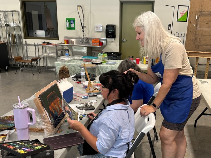
Last year, I took a step into something new — teaching demos, workshops, and classes. I started small with an underpainting workshop alongside two fellow artists, then moved into teaching a class for LifeQuest of Arkansas. More recently, I was invited to give a demo followed by a mini workshop for the Ozark Pastel Society. Finally, next week I will do a demo for the Arkansas Pastel Society.
What I’ve discovered is that I absolutely love this new role. There’s a unique thrill in watching students explore, experiment, and create — seeing the sparks of discovery, the breakthroughs, and the joy on their faces when something clicks. Sharing ideas side by side, swapping stories, and learning new approaches live and up close creates an energy that just can’t be replicated through a screen. And it’s never one-sided. While students learn from me, I learn just as much from them. It’s a true win-win.
In each of my classes, I introduced techniques that many of the artists had never been exposed to – like my “rusty truck” process. They were brave in their experimentation, diving in wit curiosity and a willingness to try something news. More than once, they surprised themselves with restuls they never though possible. Of cours, there were also moments of frustration, but those frustrations created breakthroughs toward growth.
Teaching has become more than just a new experience for me; it’s a way to share the joy of art, to learn alongside others, and to celebrate the magic that happens when creativity is explored together.
One of the biggest honors came when I attended the Ozark Pastel Society non-juried art show and saw paintings by three of my workshop students on display. To witness their courage in putting their work out into the world — and knowing I had played a small part in their creative journey — was incredibly rewarding.
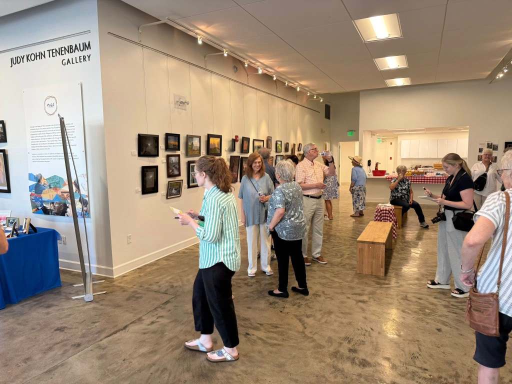
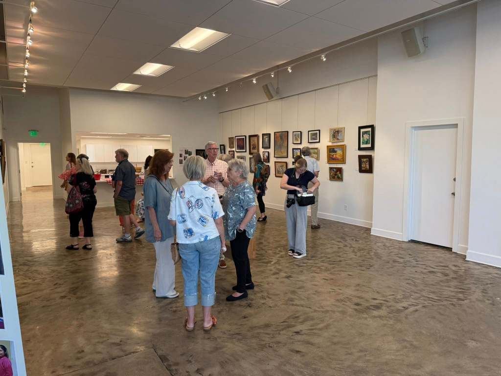
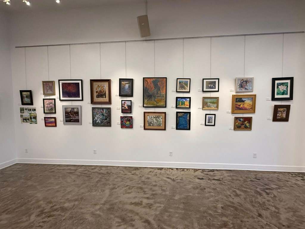
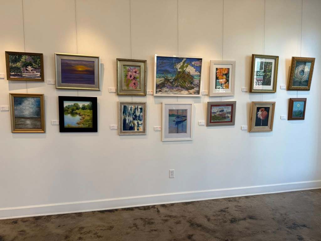
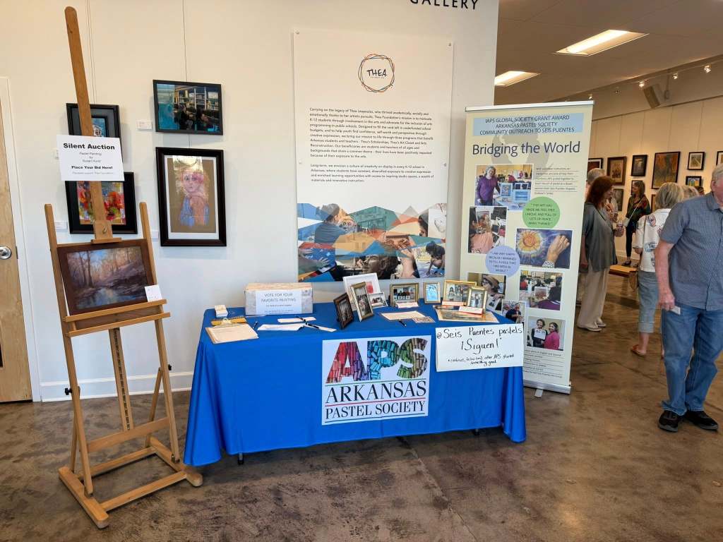
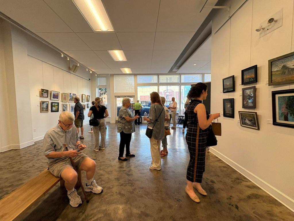
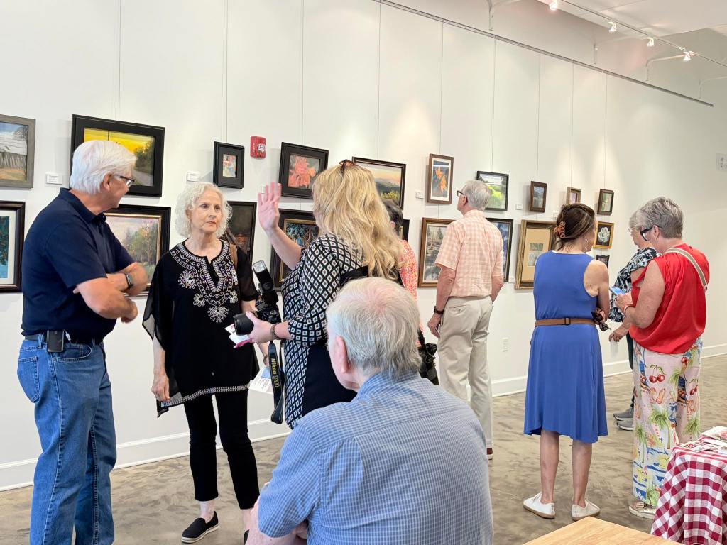
On Friday, July 18, the Thea Foundation Gallery in North Little Rock, AR, came alive with color, creativity, and community as the Arkansas Pastel Society (APS) and Ozark Pastel Society (OPS) celebrated the opening of their Joint Membership Show. Despite the sweltering summer heat, the evening was a resounding success, drawing in over 200 art enthusiasts, collectors, and fellow artists.
One of the highlights of the evening was the strong showing from OPS members making the three-hour journey to attend. Their presence helped foster a sense of camaraderie and collaboration between the two societies—a key goal of this joint exhibition.
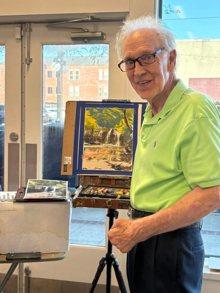
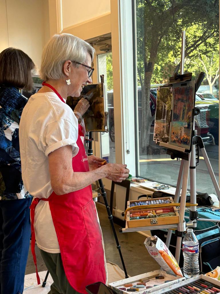
Visitors to the gallery enjoyed more than just the stunning pastel artworks on display. The reception offered an interactive experience, including hands-on pastel display and a silent auction. A dynamic “dueling demos” event, featuring artists Susan Hurst, Clarence Cash, and Debbie Strobel, captivated guests as they watched the creative process unfold in real time.
Attendees also had the chance to make their voices heard by voting for their favorite piece in the show. The coveted People’s Choice Award went to Bill Kinneman for his evocative painting, Lonely Lady—a standout work that clearly resonated with many viewers.
We extend our sincere thanks to all who attended, participated, and volunteered to make this evening such a memorable one. The energy, engagement, and enthusiasm shared by everyone in attendance are a testament to the thriving pastel art community in Arkansas and beyond.
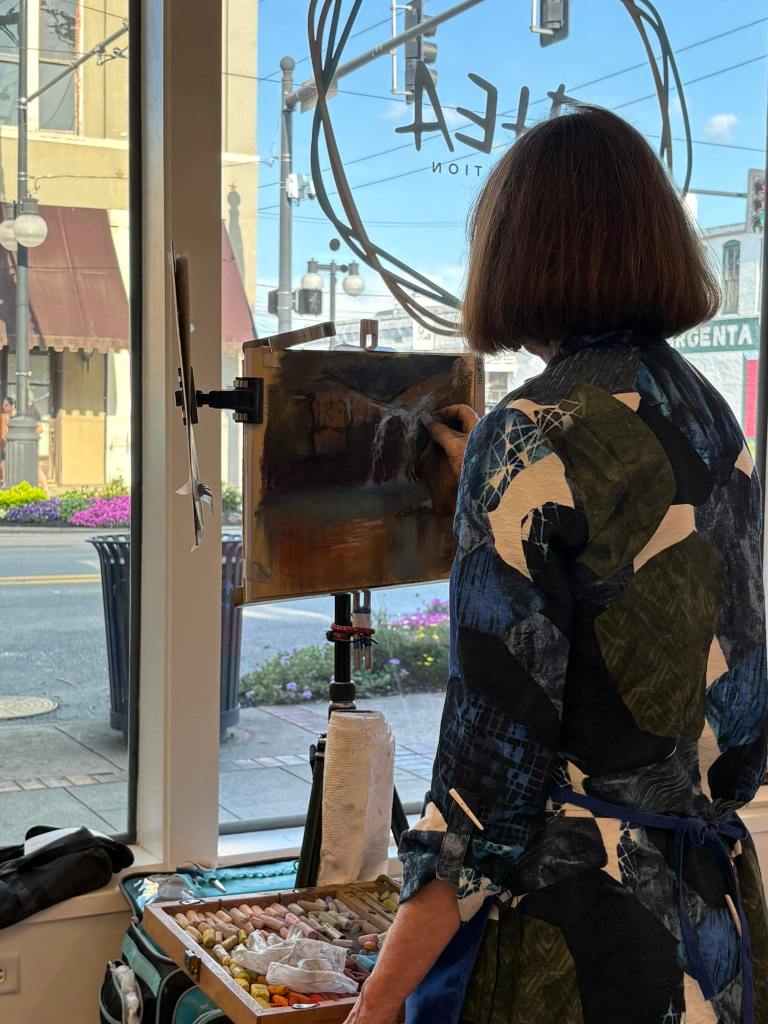
Introduction Soft pastel artists know that paper is just as important as the pastel itself. The right surface can elevate a piece by allowing your unique style and technique to shine through. With the incredible variety of pastel papers available—featuring different textures, colors, and weights—it’s easy to become overwhelmed. That’s why I ordered the Sample Pack from Dakota Pastels: to explore new options and see how each paper worked with my mark-making style and painting approach.
What I’m Looking For This review is entirely based on my personal preferences and how well each paper supports my artistic process. Here’s what I focused on:
My mark-making style (how I apply pastel).
The ability to layer pastels and retain vibrant color.
Paper that handles wet media for underpainting (acrylic or watercolor).
The texture and visual finish that the paper provides.
This isn’t a judgment on the overall quality of each paper—some may work beautifully for other artists.
My Testing Approach To ensure consistency in this experiment, I kept several variables the same:
Painted the same scene for each test.
No underpainting: direct painting with minimal blending (which aligns with my typical technique).
Used the same pastel brands: Terry Ludwig, Sennelier, Richeson Handrolled, NuPastel (hard pastel), and a new-to-me soft pastel, J.Luda.
Each test painting was done in 15–20 minutes.
I began with papers I’ve used in the past to “warm up,” then moved on to unfamiliar surfaces.
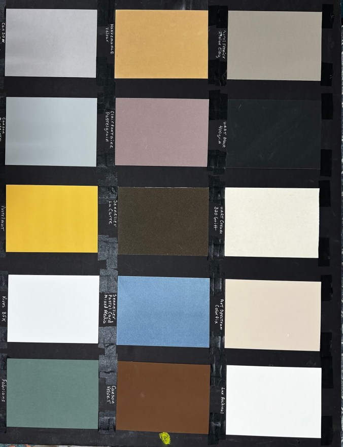
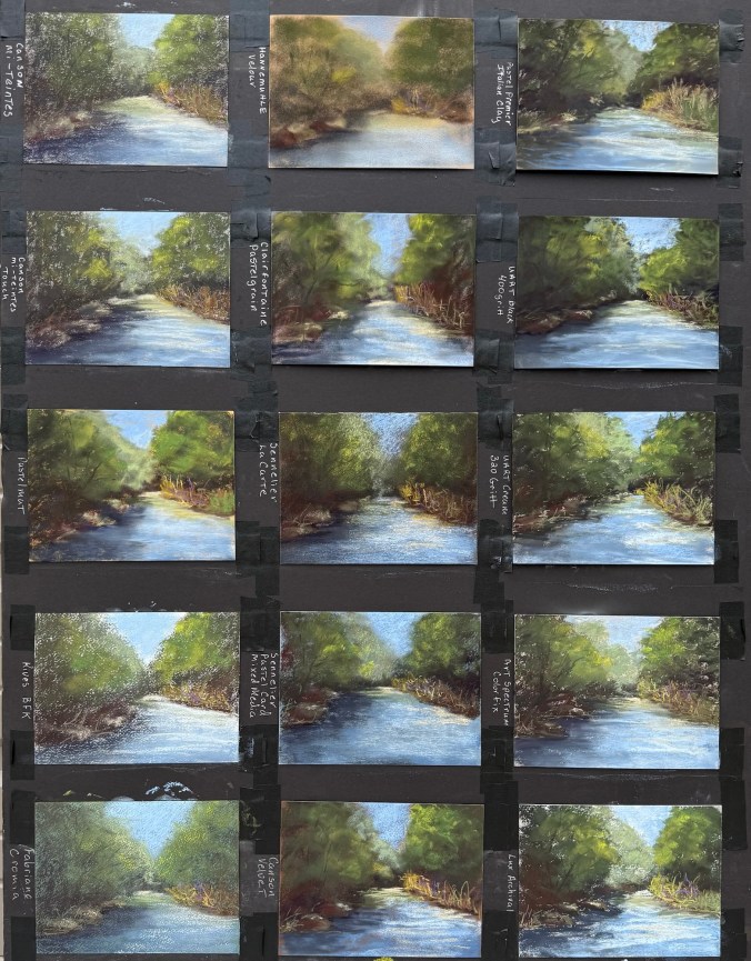
My Results (Starting from Top Right of the Sample Pack, Moving Down)
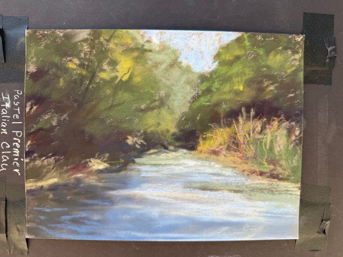
1. Pastel Premier – Italian Clay USA | 100% cotton | Medium tooth aluminum oxide grit | 310gsm | Wet media friendly A reliable favorite. Durable with a great tooth for layering, it handles strong mark-making and almost behaves like a sanded surface. I enjoy this paper for its durability and consistency. Be mindful: the paper color impacts the overall tone. Great for landscapes and rusty vehicles.
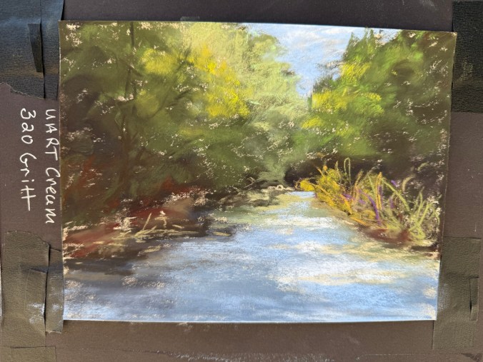
2. UArt – Cream, 320 Grit (Coarse) Germany | Sanded surface | 200 grit course to 800 grit fine | Wet media friendly My go-to paper for years. The coarse grit grabs pigment incredibly well, allowing deep layering and vibrant texture. It is best to use hard pastels like Rembrandt or NuPastel for your base layers, as soft pastels will be used up quickly. The paper can curl, but flattens easily. I’ve used this paper for landscapes and rusty vehicles.
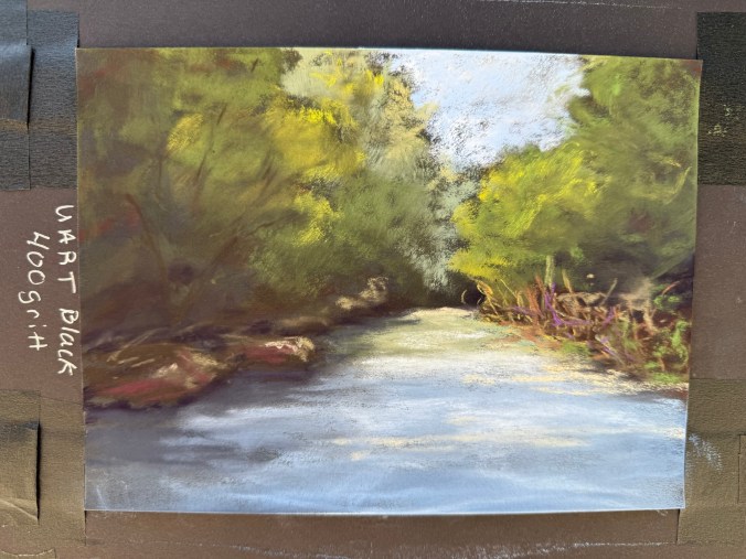
3. UArt – Black, 400 Grit (Medium) Same durable performance as Paper #2 but in black and slightly finer grit. The black surface intensifies color vibrancy and subtly blends tones. A noticeable shift in mood and contrast between this and the cream version. I’ve used this paper for rusty vehicles, and I can see using it for future landscapes.
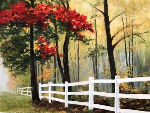
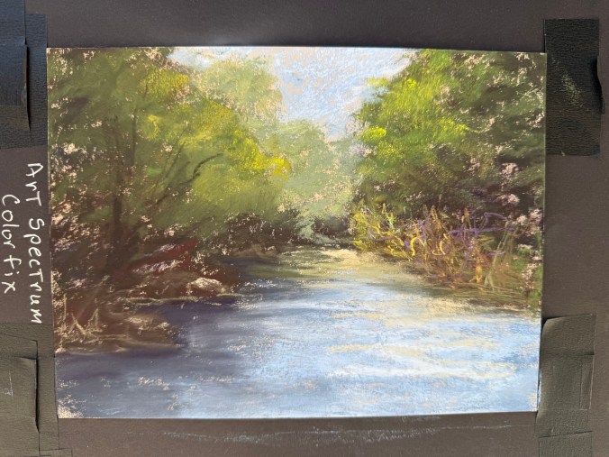
4. Art Spectrum Colourfix – Cream Australia | Acrylic-primer on watercolor paper | Medium tooth | 300gsm | Wet media friendly It’s been years since I used this paper, and it pleasantly surprised me. Good texture, not too hard on pastels, and lots of layering potential. Available in many colors—great for creative paper integration in your design. Some of my favorite landscapes were created on this paper like Komorebi (see painting with red leafed trees below), allowing the yellow paper to show through. I have not used this paper on rusty vehicles as I don’t believe it is gritty enough.
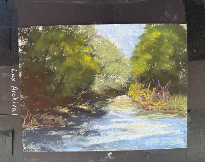
5. LuxArchival France | 100% cotton | Medium/coarse tooth | 300gsm | Wet media friendly Gritty to the touch but goes on smoother than expected. This is a strong contender for future landscape and rusty vehicle work. It held pastel well and delivered clean layering. I actually have larger sheets of this paper, just haven’t gotten around to using it.
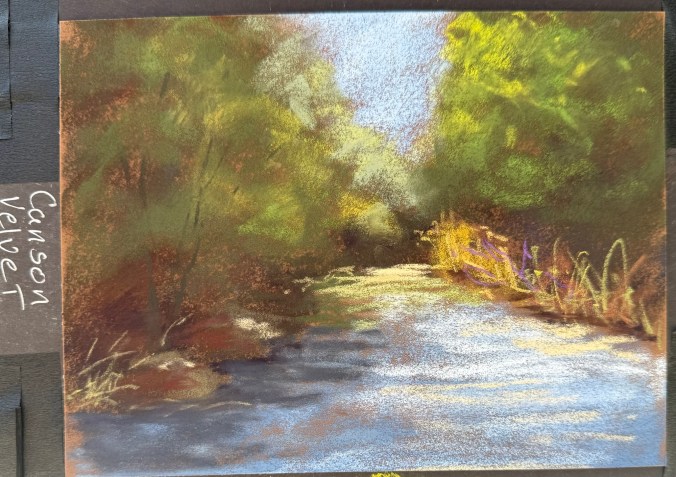
6. Canson Velvet France | toned paper with a velvety finish | 430gsm | Wet media friendly Though it doesn’t feel “velvety” to the touch, pastels glide smoothly over it. Rich color retention, softer final look. The pastel fills the tooth consistently, and it covers the paper well. NuPastels glide over the paper, so I needed to adjust my pressure to make the marks. Blending required a bit more pressure. The velvet left more texture than I expected. Possibly a great choice for animal portraits.
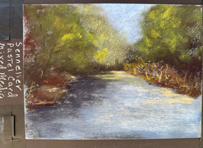
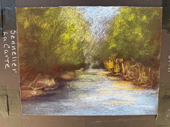
7. Sennelier La Carte Pastel Card – Mixed Media France | coated in a fine layer of cork powder for a light grain | 410gsm | Water and solvent resistant Rough surface with unique texture—not like sanded paper. The paper didn’t chew through the pastels, but I didn’t fill the tooth (on purpose for consistency). I may wash the paper and try mixed media.
8. Sennelier La Carte Pastel Card France | coated in a fine layer of cork powder and vegetable flakes |medium surface | 360gsm | For dry media only This didn’t work well for my style for landscapes—left a grainy look due to how I apply pastel. It might work for rusty vehicles.
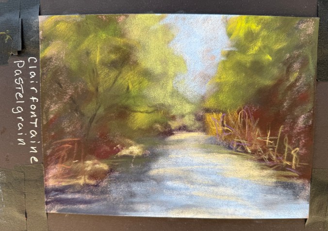
9. Clairefontaine – Pastel Grain France | 360gsm | Wet media friendly Lightly textured and soft-looking, especially when blended. Nice velvety finish when blended. It may be great for delicate subjects like pet portraits.
10. Hahnemühle Velour Germany | Synthetic fibers | 260gsm Truly feels like velveteen rabbit fur! Very soft surface that holds lots of pastel. Produces a romantic, dreamy look—ideal for soft subjects like animal portraits.
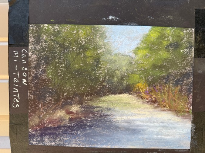
11. Canson Mi-Teintes France | 160gsm | Honeycomb texture one side, fine grain other | I don’t believe this paper can get wet Not ideal for layering—pastels get muddy fast. Needed to blend more than I usually do as the pastel didn’t cover well. This paper didn’t suit my technique well.
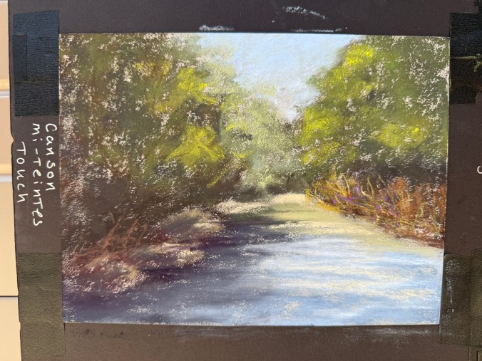
12. Canson Mi-Teintes Touch France | Micro-abrasive coating | Wet media friendly Very different from the original Mi-Teintes. I found layering difficult—colors muddied instead of building cleanly. This paper didn’t suit my technique well.
13. Pastelmat France | Unique synthetic surface | 360gsm | Wet media friendly Varied response depending on pastel brand—some went on velvety, others gritty. Required quite a bit of blending. It holds the pastel well, but may need some technique adjustments.
14. Rives BFK France | 100% cotton | Printmaking paper While absorbent and soft, it didn’t support my pastel technique well. Even Terry Ludwig’s darkest shades looked faint. When I did some research, this is a printmaking paper, and it doesn’t work well with my style. Maybe a blended underpainting would solve the issue of the texture showing through.
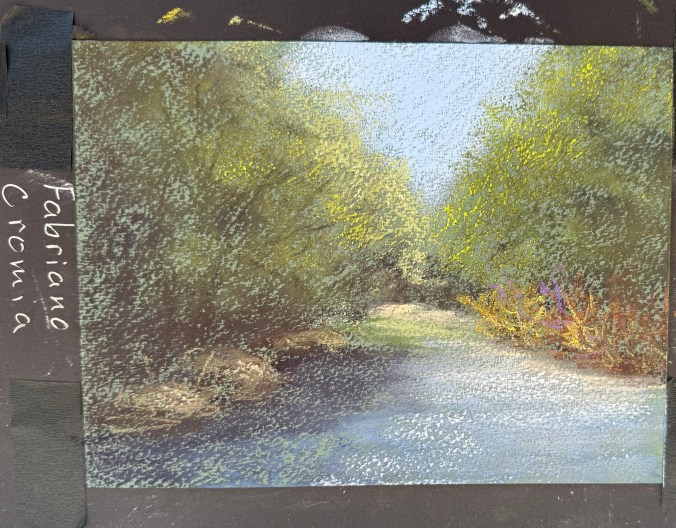
15. Fabriano Cromia Italy | 50% cotton and 50% alpha-cellulose | 220gsm | Light wet media Very similar to Rives in feel and performance. It would likely benefit from underpainting to combat paper texture showing through.
Final Thoughts Exploring this wide range of pastel papers was enlightening. Some surfaces reaffirmed my continued use of Pastel Premier, UArt, and Art Spectrum; others surprised me, and a few didn’t suit my process, but may work well for artists with different styles or subject matter. I’m excited to revisit a few LuxArchival, Sennelier LaCarte Pastel Card Mixed Media, and Sennelier LaCarte Pastel Card with a more tailored approach and see what evolves.
If you’re thinking of trying a new paper, I highly recommend getting a sample pack and putting each one to the test. You never know what might become your next favorite surface!