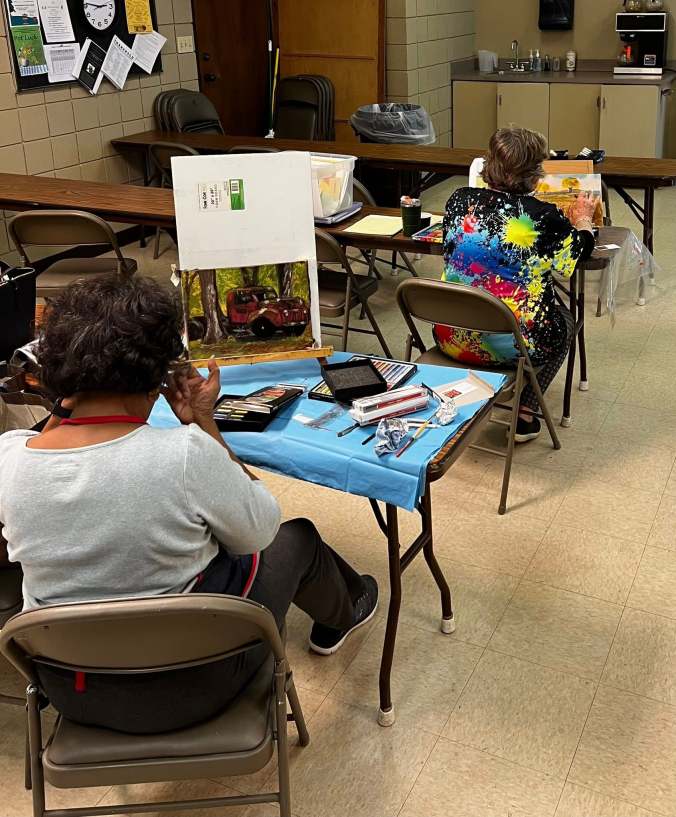
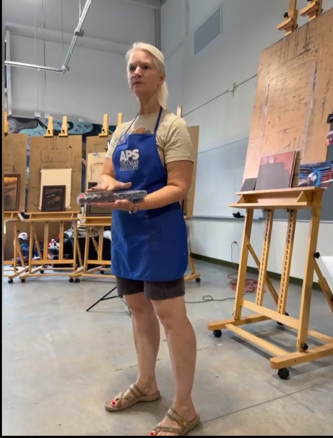
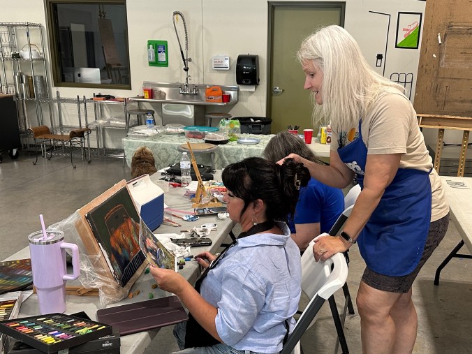
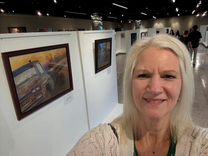
It is an honor to exhibit once again with my daughter, Evelyn Laurence. We’ve been working hard for the last two years to prepare for this show. We cordially invite you to attend the Opening Reception and help us celebrate!
Where: Argenta Library Gallery, 420 Main Street, North Little Rock
When: Meet the Artists at the Opening Reception, March 20, 2026, at 5:00 – 8:00 pm
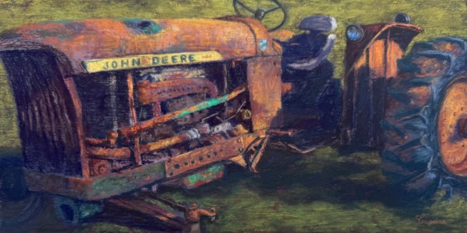
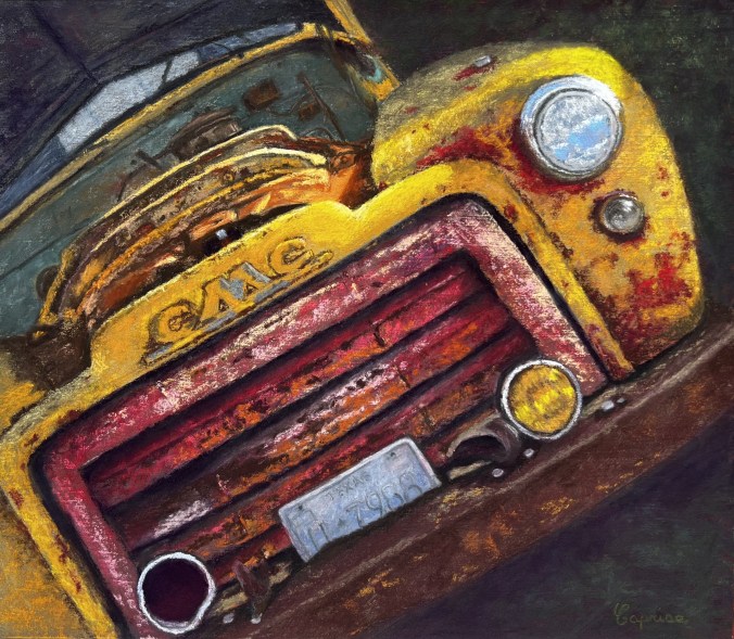
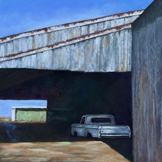
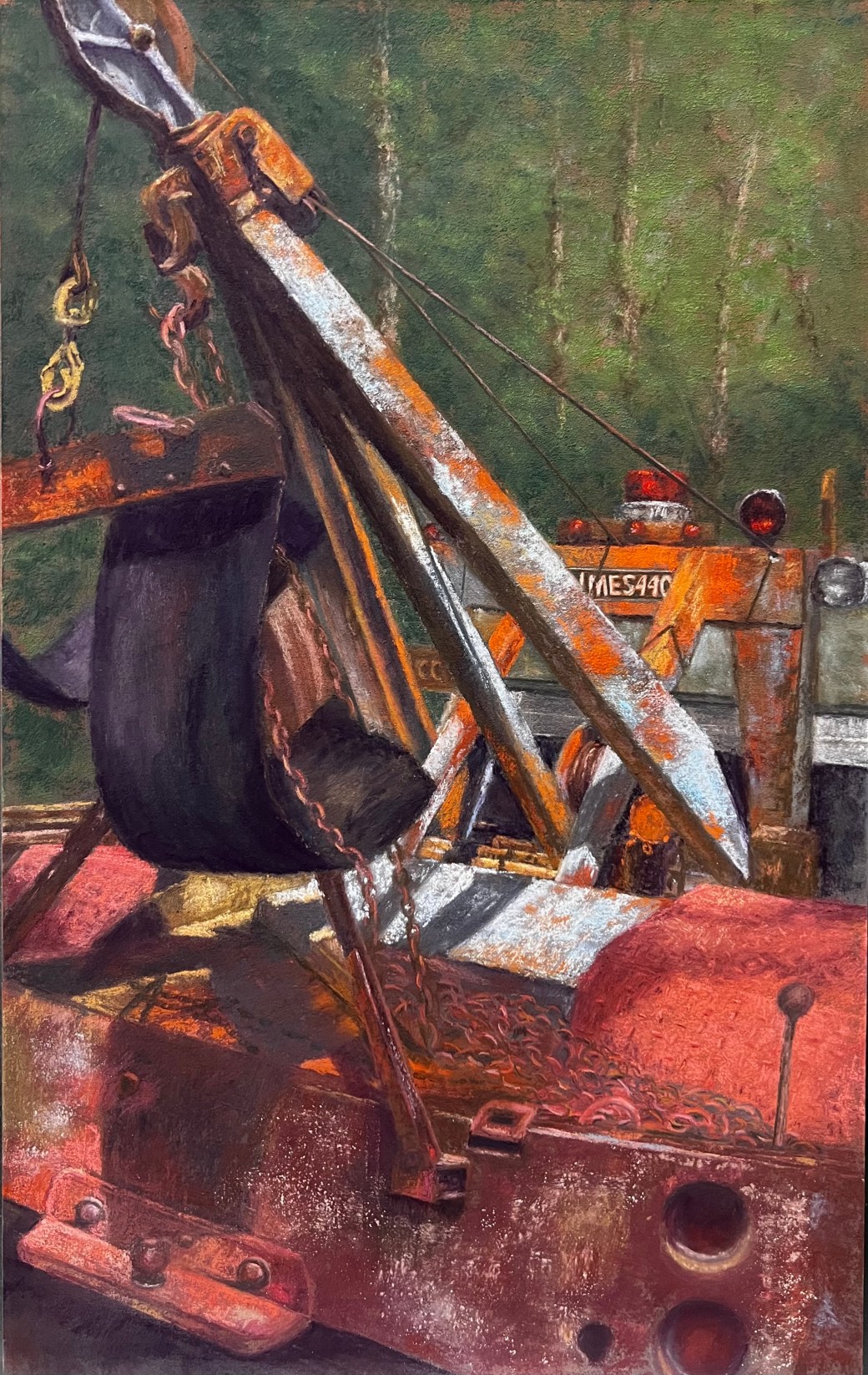
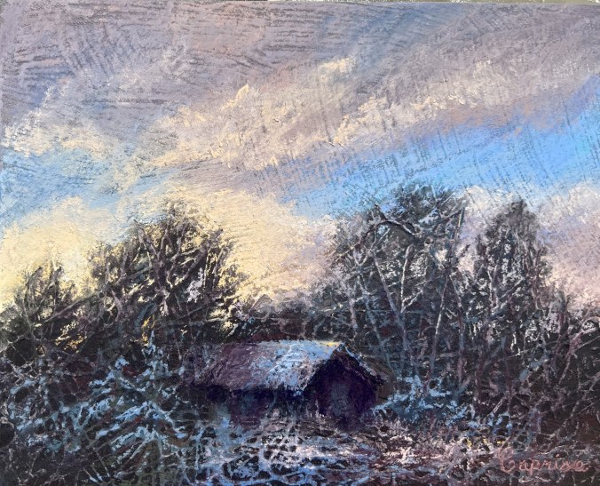
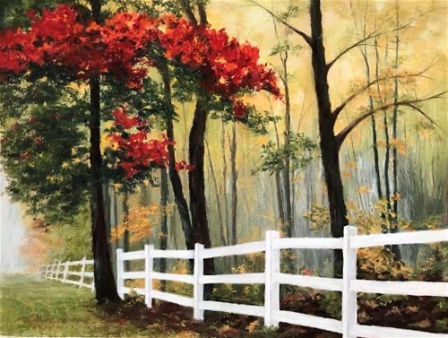
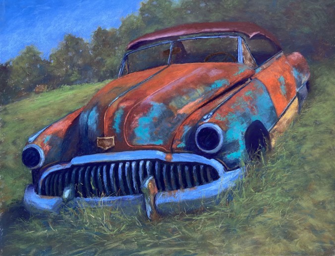
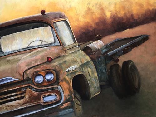
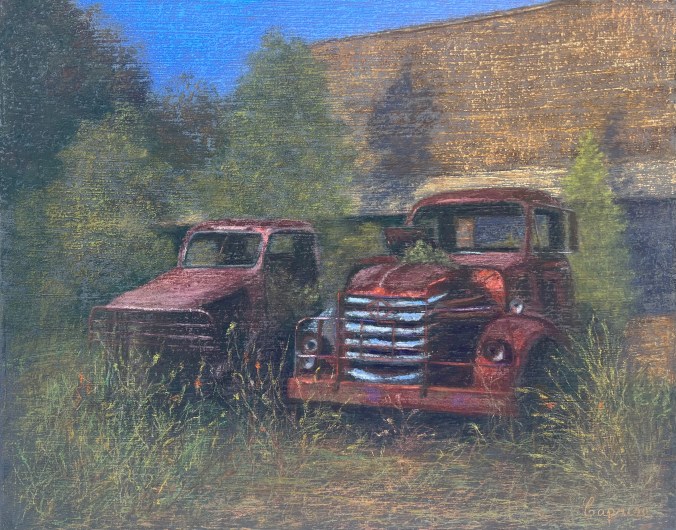
Architecture, Rust, Treasures (ART) is an exhibition that explores the wonders of nature and the hidden treasures found within the landscapes that connect us. This collection reflects a shared passion for discovering lost, weathered, reclaimed subjects and reimagining them as something new.
ART is a mother-and-daughter exhibition that celebrates the beauty hidden in our world, from forest finds to overlooked architectural details. Through a variety of compositions and subjects, the artists express a deep appreciation for history, transformation, and the stories objects and places hold over time.
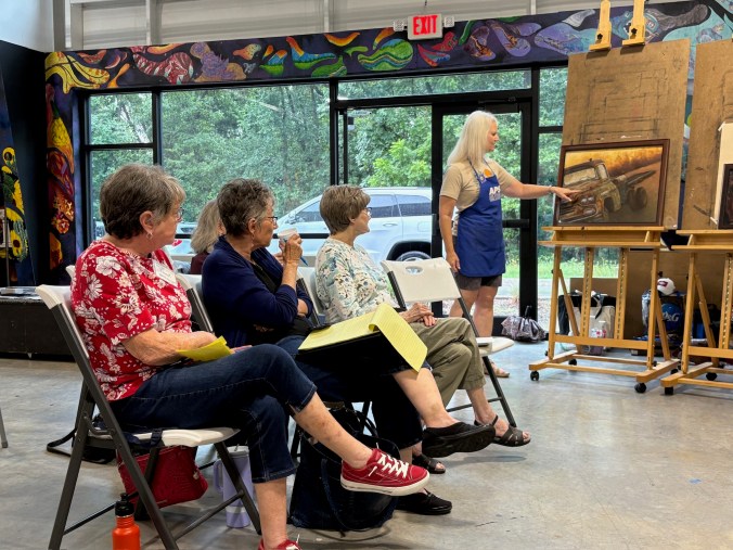
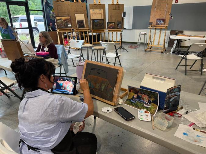
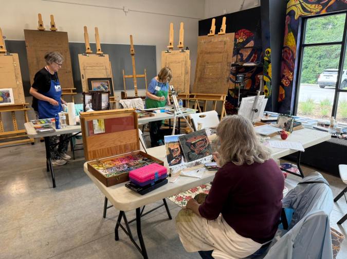
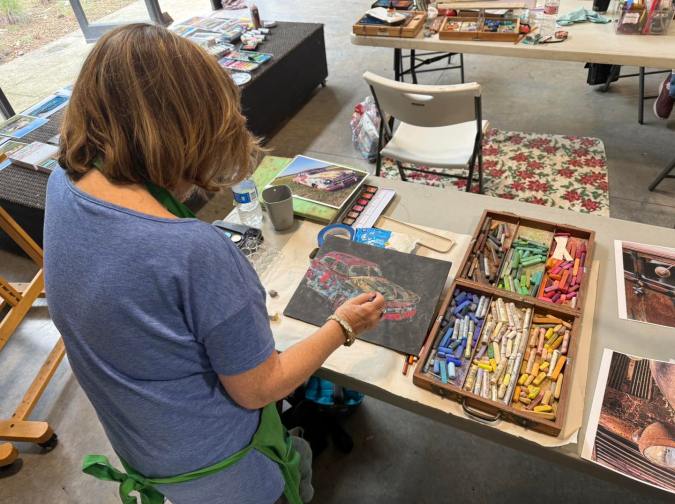
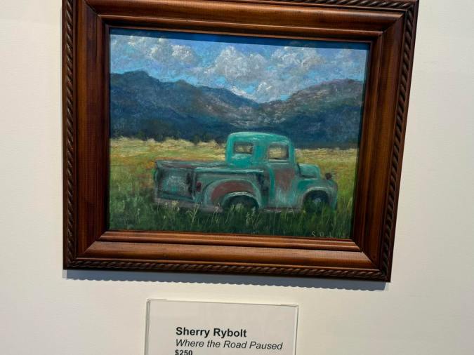
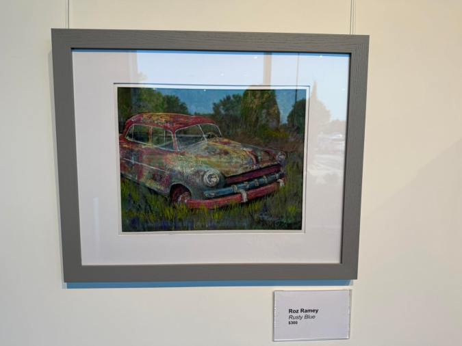
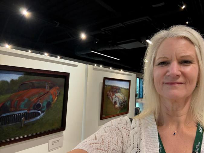
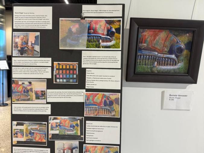
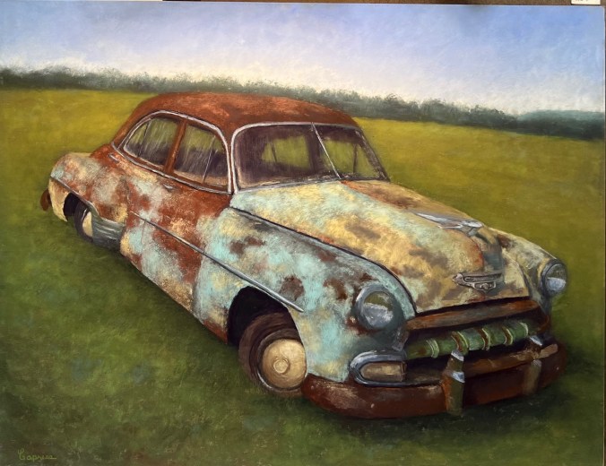
The exhibition features imagery of old structures that have existed for generations, some of which once belonged to our own family. A series of works inspired by rusted vehicles began with a 1951 Mercury converted truck bed discovered on our homestead. The collection moves across pastel, pencil, ink, and acrylic, reflecting the richness and versatility of our artistic voices.
Representing the next generation is seven-year-old Bearrett Laurence, the third-generation descendant of the Cooper family. He will be exhibiting in this show with his third painting, marking the continuation of a family tradition rooted in creativity.
ART is a celebration of imagination, craftsmanship, and the special bond between mother, daughter, and grandson, illustrating how a love of art is passed down through generations. We hope this exhibition—and the stories behind it—leave you inspired, moved, and deeply touched.
The show runs through March 20, 2026 – April 3, 2026. The Gallery is open Monday through Friday from 9 am to 6 pm. Except March 30th and 31st.